User Guide Addovation Change
Last Updated: 2026-02-16
Introduction
- This document provides guidance on how to use the Addovation Change add-in to create and use Excel templates.
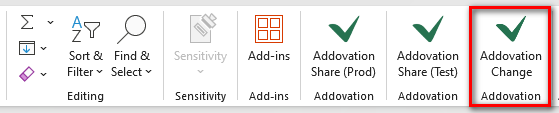
Addovation Change task pane
- The task pane is opened by clicking the Addovation Change button in the
Hometab of the office ribbon.
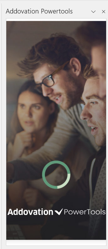
- This action will prompt a splash screen to appear on the right side of the Excel document.
Sign into the Application
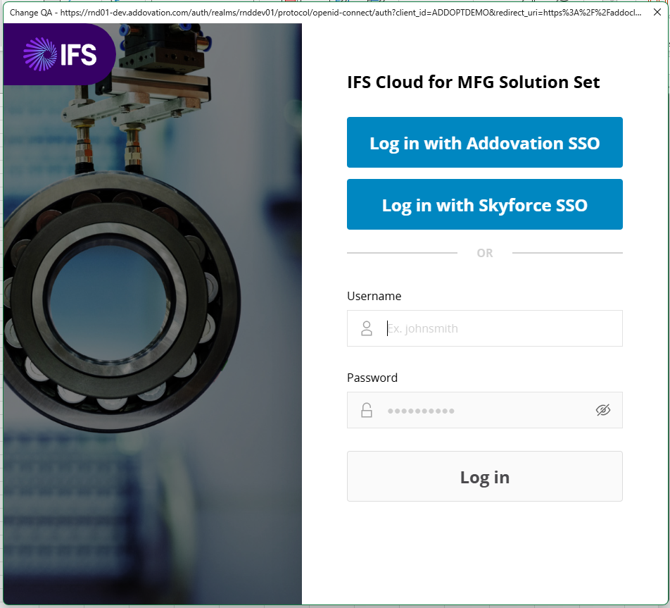
- After the splash screen, the user is automatically directed to the
Sign Inpage. On this page, the user must enter theSubscription Access Keyto access the application.
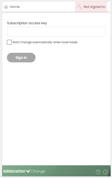
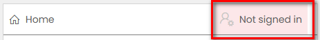
- The user can also open the Sign In screen at any time by clicking the
User Accounttab in the menu ribbon. Until the user signs in, the tab will displayNot signed in.
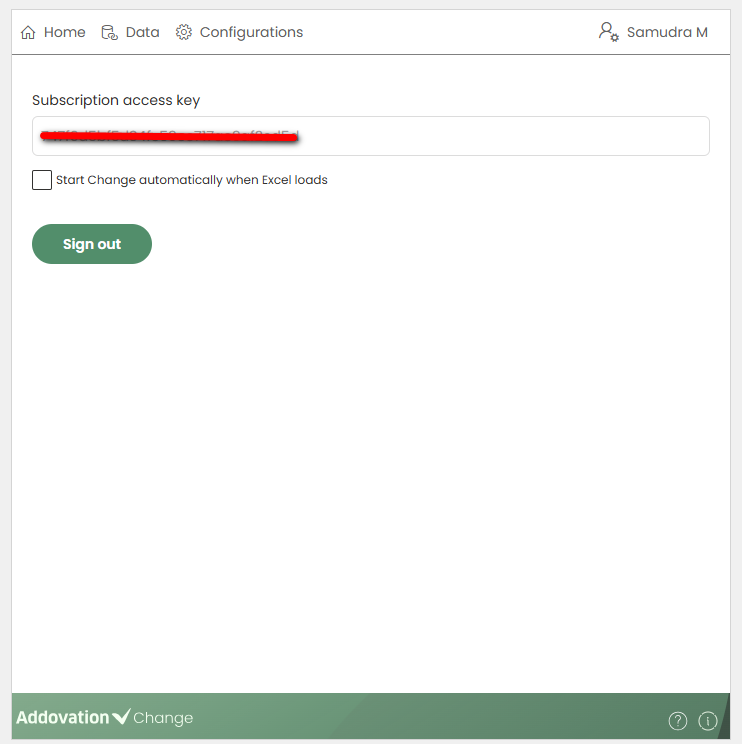
Subscription Access Key
The access key for the subscription is available in
Cloud Portal.Subscription access key is required to connect to the backend and determine the user’s role in the Change add-in.
There are two user roles:
Template CreatorandTemplate User.Template Creators can create, update, and delete templates using the Change add-in.
Template Users can use the templates created by Template Creators.
Optional Setting
Below the
Subscription Access Keyfield, there is a checkbox. If this checkbox is selected, the Change Task Pane will open automatically the next time a document is opened.After entering the access key (and optionally selecting the checkbox), the
IFS Authenticatorwindow appears, allowing the user to:- Enter their username and password, or
- Sign in using
Addovation SSOorSkyforce SSOby selecting an account.
- Once signed in, the user will be directed to the
Home Page. To log out of the application, the user can click theUser Accounttab in the menu ribbon.

Menu Ribbon
Menu ribbon contains different tabs as follows.
Home Tab
The Home tab is visible to both
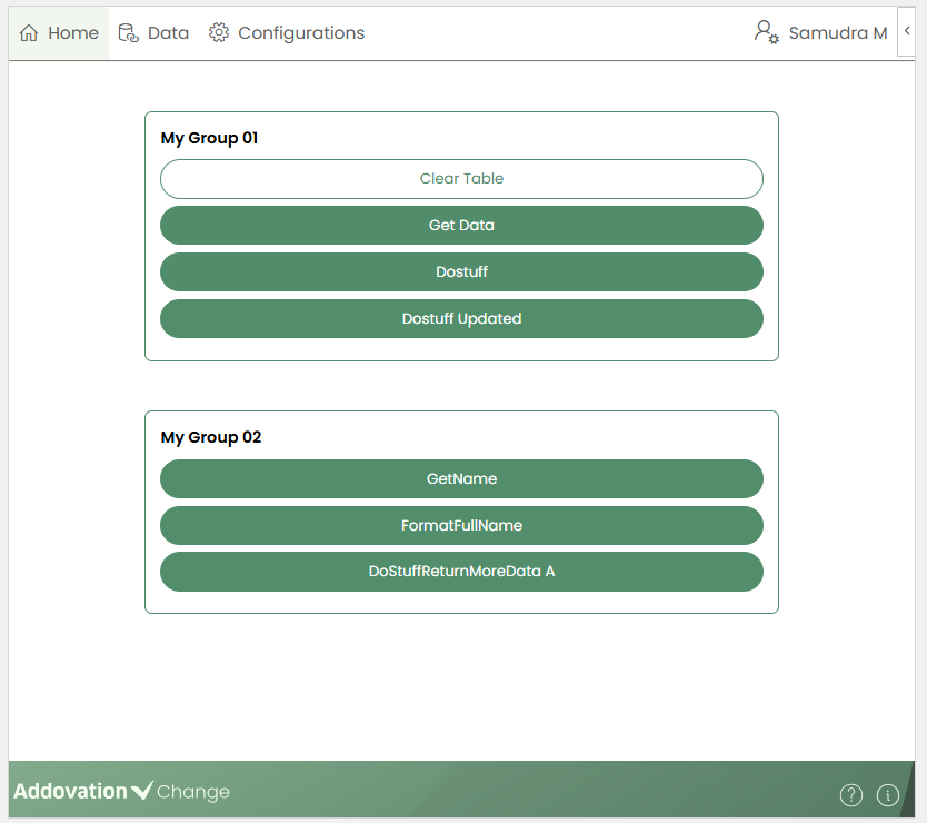
Template CreatorsandTemplate Users. Once a template is created and projections are added to the workbook, they are displayed in this tab.Any customized groups created (explained in later sections) are also shown on the Home page.
Data Tab
- The Data tab is available only to
Template Creators. It allows users to search for projections and configure operations for the selected projections.
Configurations Tab
- The Configurations tab is also available only to
Template Creators. It provides various configuration options.
Notification Tab
- The Notifications tab displays system notifications and is available to both
Template CreatorsandTemplate Users.
User Account Tab
- The User Account tab allows users to sign in to or sign out of the application. It is available to both
Template CreatorsandTemplate Users.

Bottom Bar
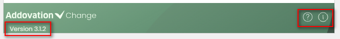
The bottom bar displays the
Application logo, aHelp icon, and anInformation icon.- When the user hovers the cursor over the bottom bar, it expands to show the
application version. - Clicking the Help icon opens the
documentation site. - Clicking the Information icon opens the
connected IFS environment.
- When the user hovers the cursor over the bottom bar, it expands to show the
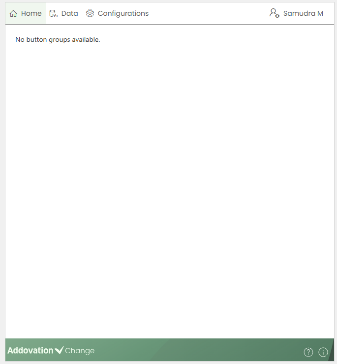
Home Tab
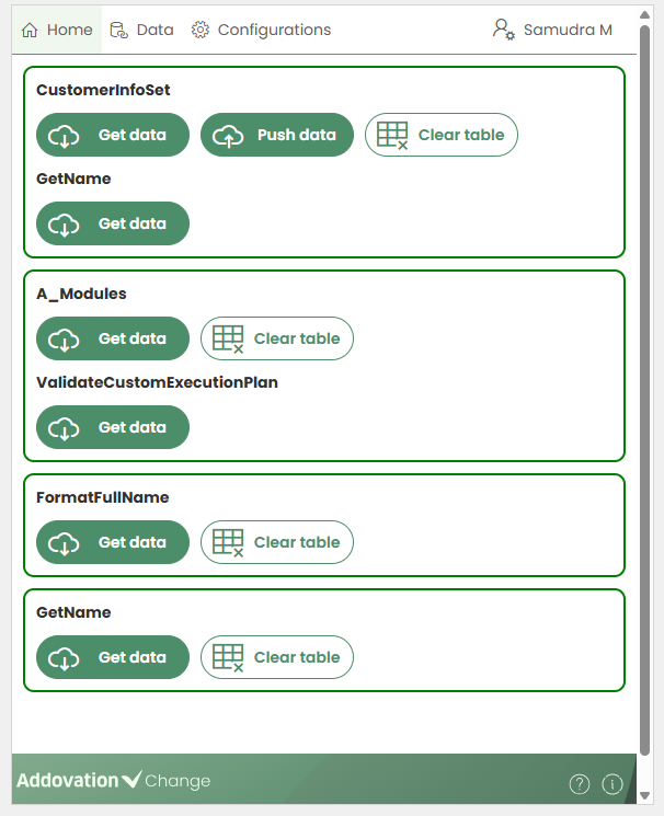
- Once signed in, the user is directed to the Home tab. When no projections have been added to the workbook, a message is displayed on the Home page, as shown below.
When projections are added,
entity setsandquick reports are grouped together with anyactionsorfunctionslinked to the same Excel table and displayed in the home tab.Actions and functions that are connected to
custom tablesor added in the header without linking to a table created by the template creator are listed separately.If any
customized button groupshave been created, they are displayed on the Home page accordingly.
Data Tab
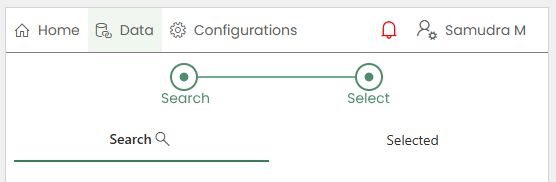
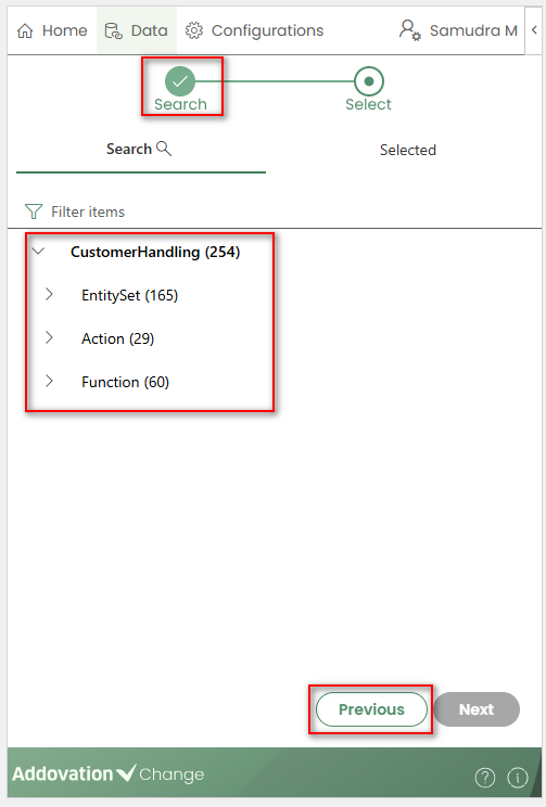
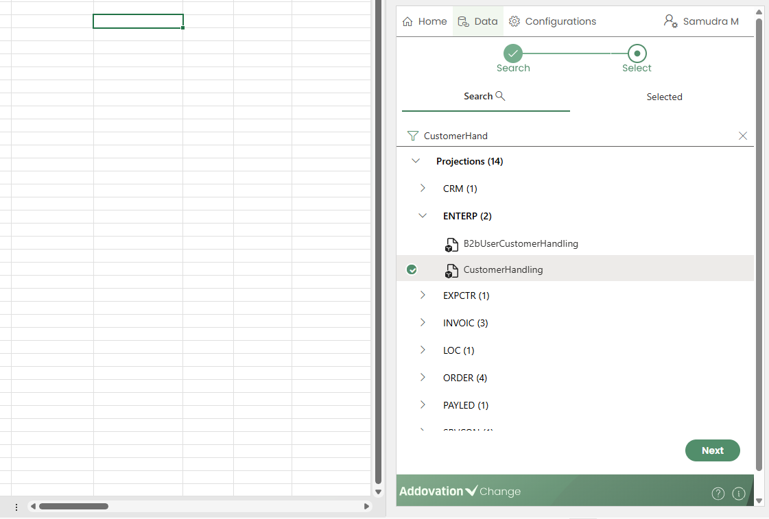
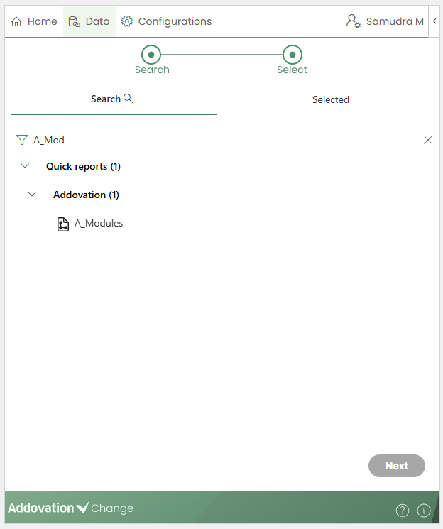
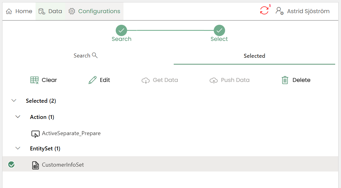
The Data tab is available only to Template Creators. In the data tab, there are two available tabs:
SearchandSelected.Searchtab allows creators to search for projections.Selectedtab displays a list of selected items categorized underEntity Sets,Actions,FunctionsandQuick Reports.A
progress barat the top of the pane indicates the status and progress of the steps.
The Search and Selected tabs can be navigated while keeping an item selected, and the search results will remain unchanged.
Search for a Projection/Quick Report
Creators can search for projections by entering a search criterion. The results are automatically filtered as the user types.
The entered criterion can be cleared by clicking the
xicon.Matching projections are displayed grouped by Component, while Quick Reports are displayed grouped by Category.
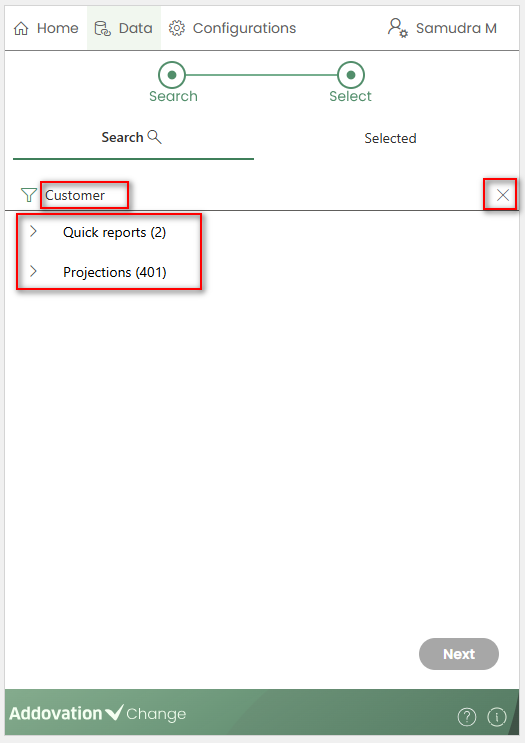
When no search criterion is entered, all available Projections and Quick Reports are listed, grouped by Category by default.
Selecting a Projection
A projection can be selected in either of the following ways:
Double-clickon the recordSingle-clickon the record, then click theNextbutton
The
Nextbutton remains disabled until a projection or quick report is selected.
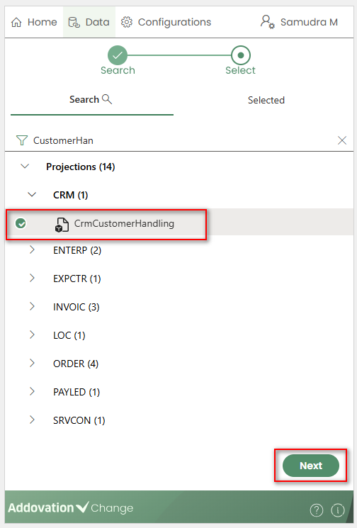
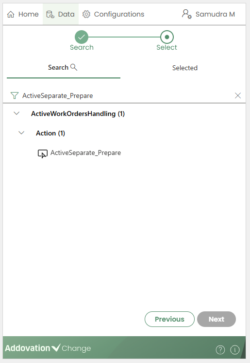
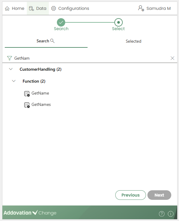
At this stage,
Searchis selected in the progress bar.In the next step, expanding the selected projection will display its
Entity Sets,Actions, andFunctions.You can navigate back to the projection search results at any time by clicking the
Previousbutton.The list can be filtered by typing in the search field.
The required projection type (Entity, Action, or Function) can be selected in either of the following ways:
Double-clickon the itemSingle-clickon the item, then click theNextbutton
Once selected, the
Selectstep in the progress bar will be marked as complete, and users will be taken to theSelectedtab immediately after double-clicking or clickingNext.
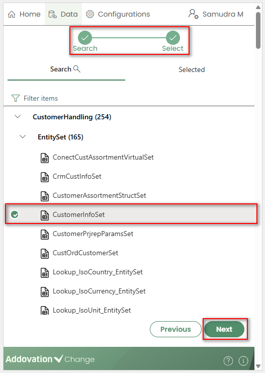
The newly added projection will appear at the top of the Selected list, and the configuration window will automatically open, focusing on the relevant record.
In the Selected section, projections are listed grouped by Entity Set, Action, and Function.
The number of items selected in each category is shown in brackets next to the category label.
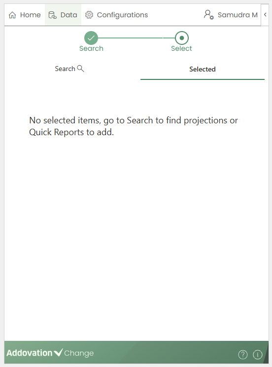
- In the Selected tab, if no projections have been selected, the following message will be displayed.
Entity Sets
An Entity Set is represented as a table on the worksheet. Before inserting it, you must first select a cell in the Excel sheet where the table will be placed.
The selected Entity Set will be inserted at the chosen position.
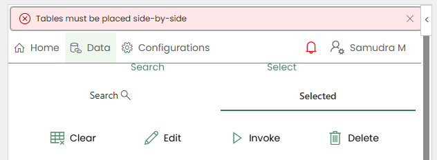
If the sheet contains multiple tables, they should be placed side by side, not on top of each other.
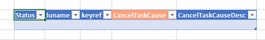
The inserted table will have a
Statuscolumn automatically added as the leftmost column, which will display the status from saved operations.Key columns will be colored with a different color. The user can add more columns to the table if necessary.
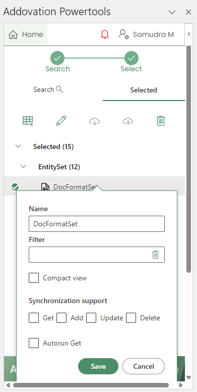
Entity Set Properties
As explained earlier, the entity set properties dialog is automatically opened when the table is inserted.
It can also be opened using the
Editicon.
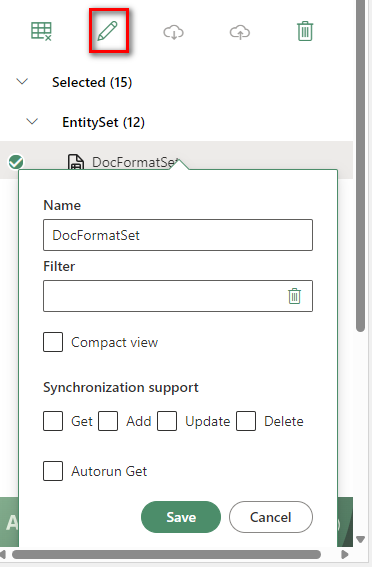
Name
- This field appears first in the Entity Set Properties dialog. It defines how the projection will be displayed in the list and can be edited by the user.
Operations
The Operations section is expandable and is open by default.
Hovering over the
information iconnext to the Operations label displays a tooltip:Allowed operations.The section contains five checkboxes, each representing a different operation that can be enabled for the selected entity set:
Get: Populates the table by retrieving data.Add: Adds new items by inserting rows into the table.Update: Modifies existing items in the table.Delete: Removes items from the table.Autorun Get: Will run the entity set automatically, i.e. clear the table and fetch the data again, when the user signs in to the application.
Note
Not all operations are supported for every entity set. To see which operations are available, refer to the Projection API.
Important
Columns can be deleted from the table, but key columns cannot be removed if the table is to be updated. In addition to key columns, the Add operation may require other mandatory columns. The mandatory columns for each entity set can be found in the Projection API.
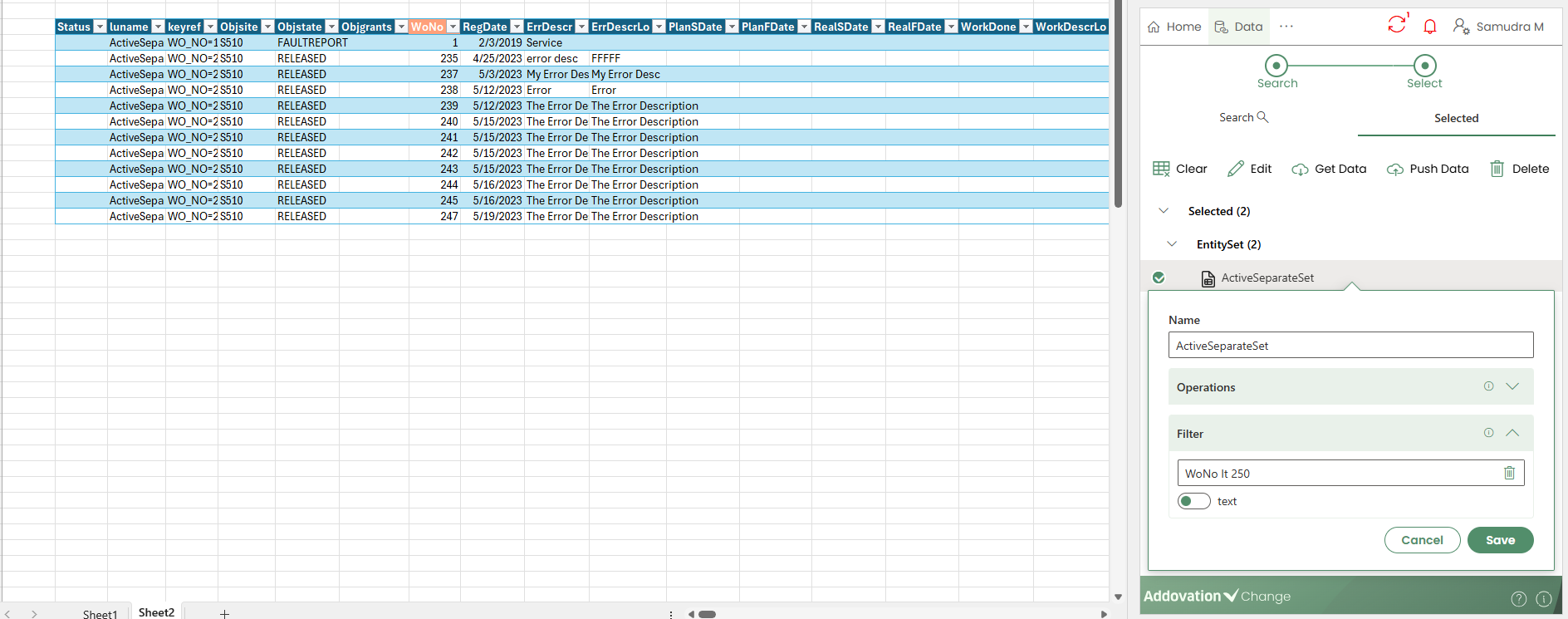
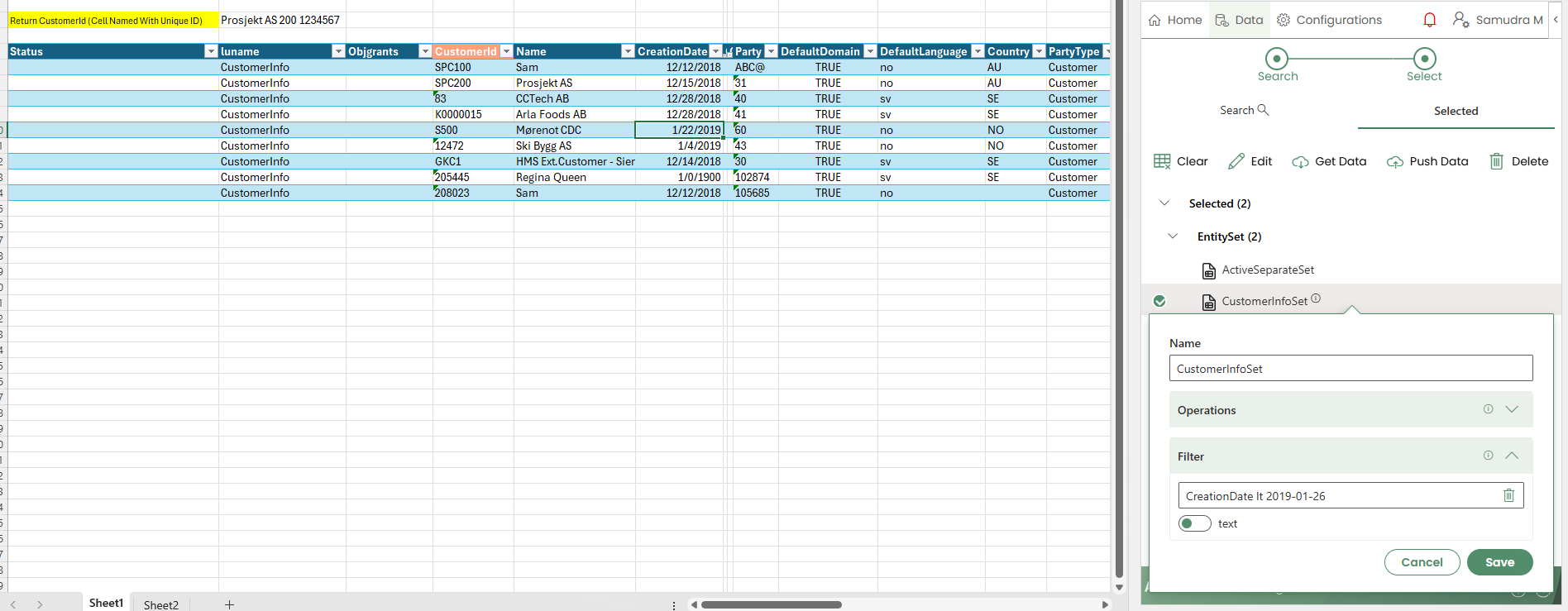
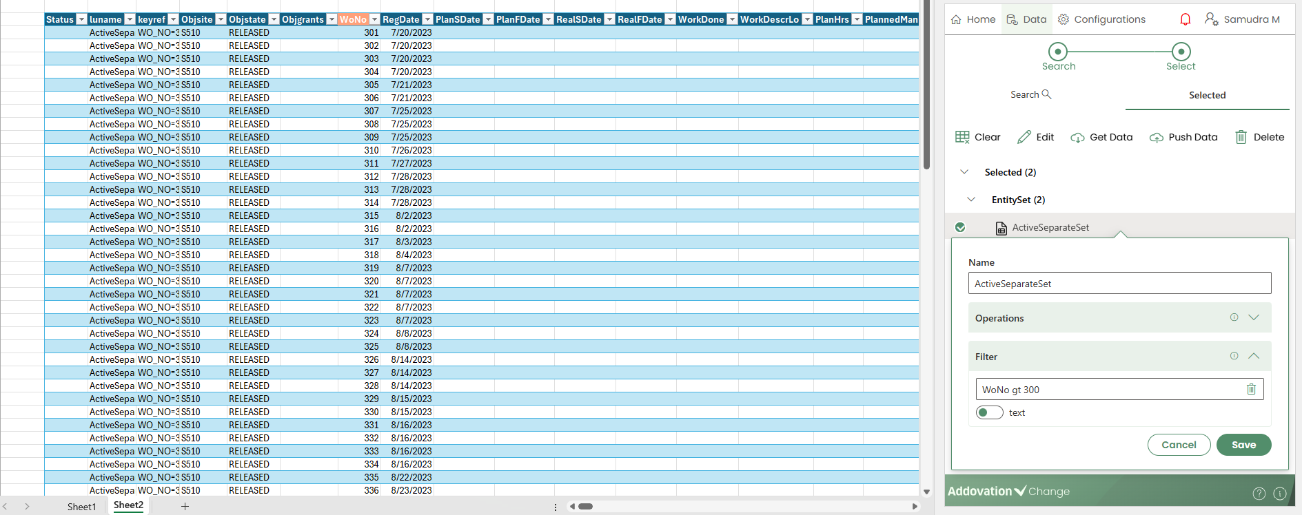
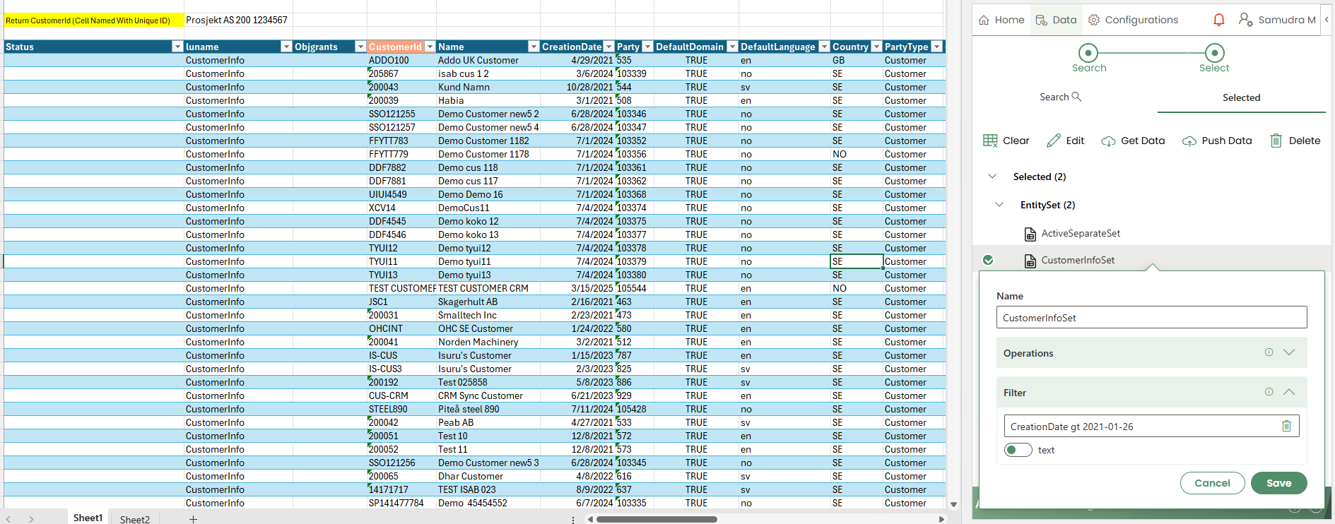
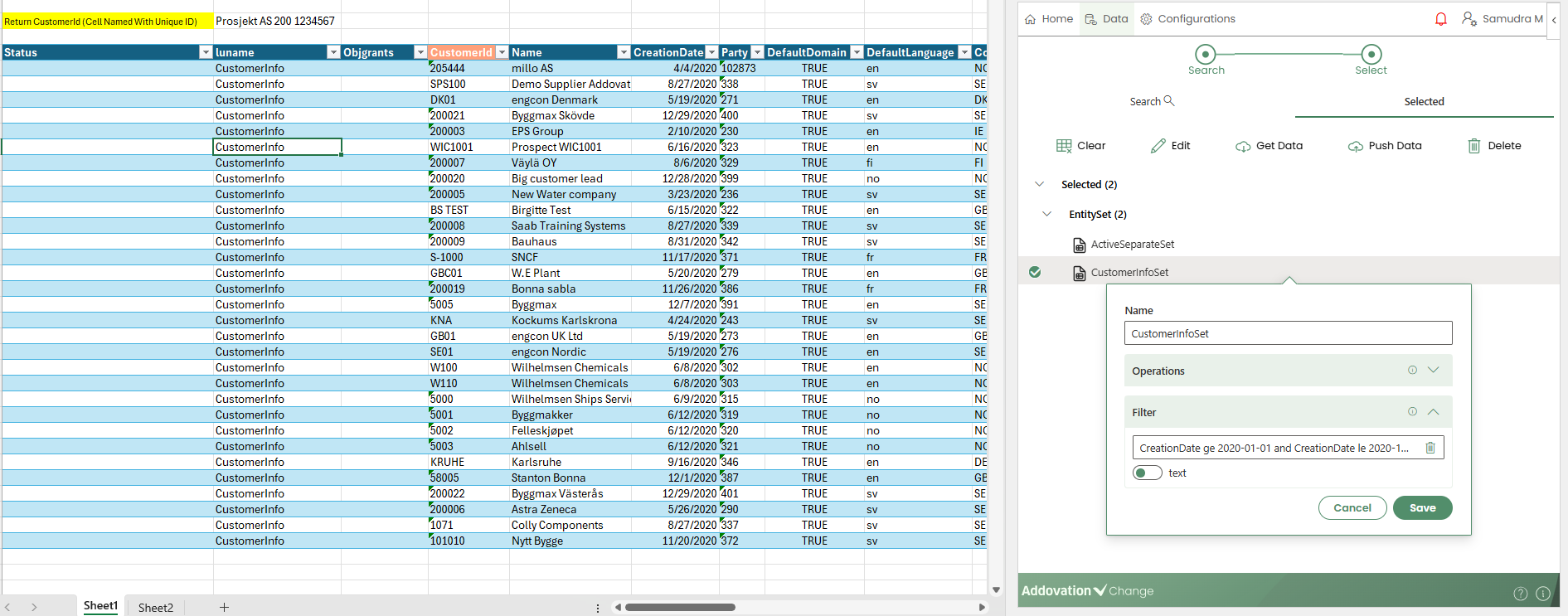
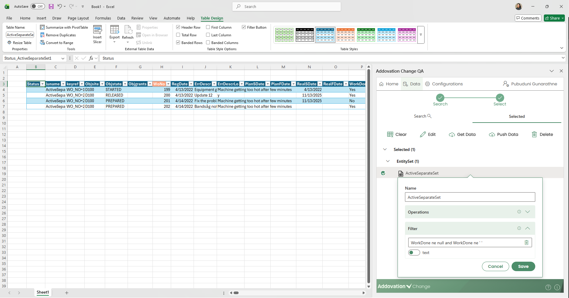
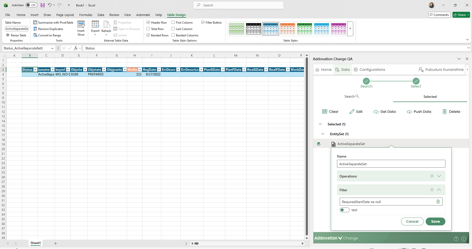
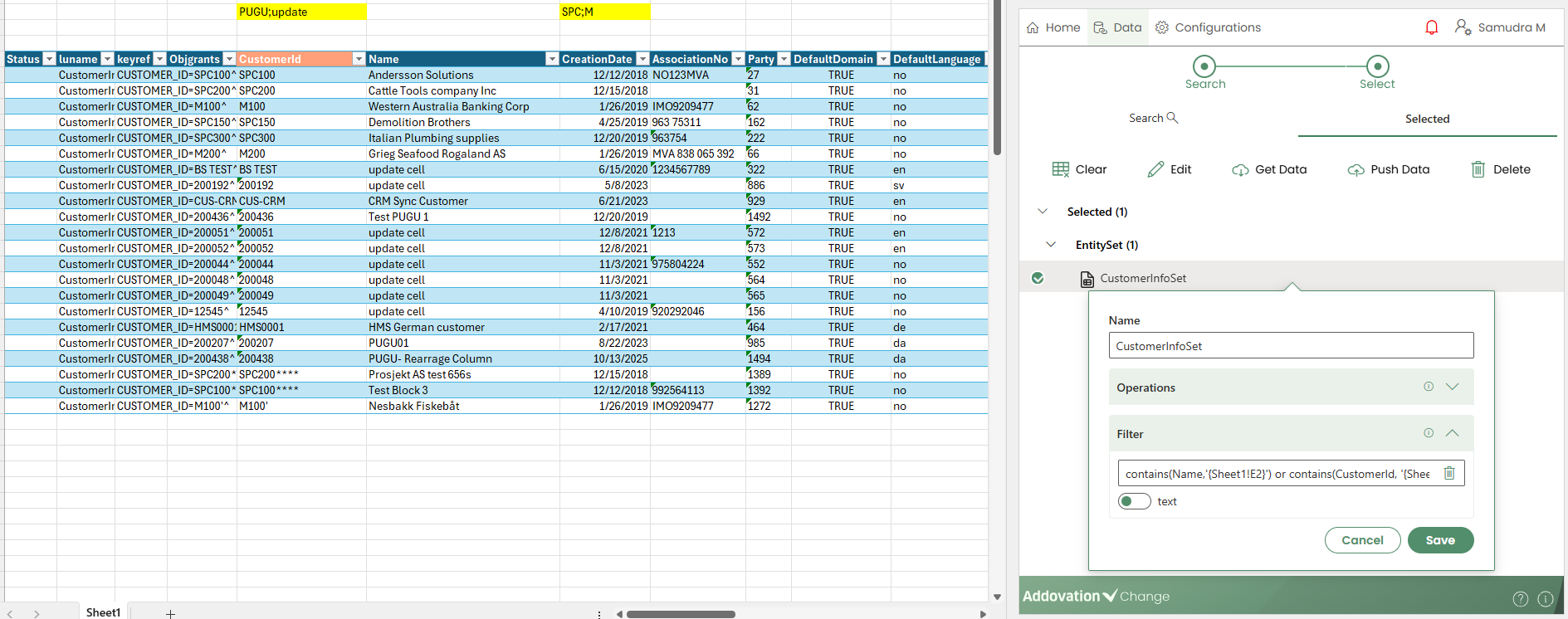
Filter
- The Filter section is expandable and allows users to apply filters to the OData query used for fetching data.
Text Filter
- In the Text filter, the filter can be either hard-coded or reference a cell in the workbook. The following are sample OData filter scenarios supported by the Text filter for reference.
- Less Than: lt
Example 01: WoNo lt 1000
Example 02: CreationDate lt 2019-01-26
- Greater Than : gt
Example 01: WoNo gt 900
Example 02: CreationDate gt 2021-01-26
- Between two values
Example 01: WoNo ge 200 and WoNo le 404
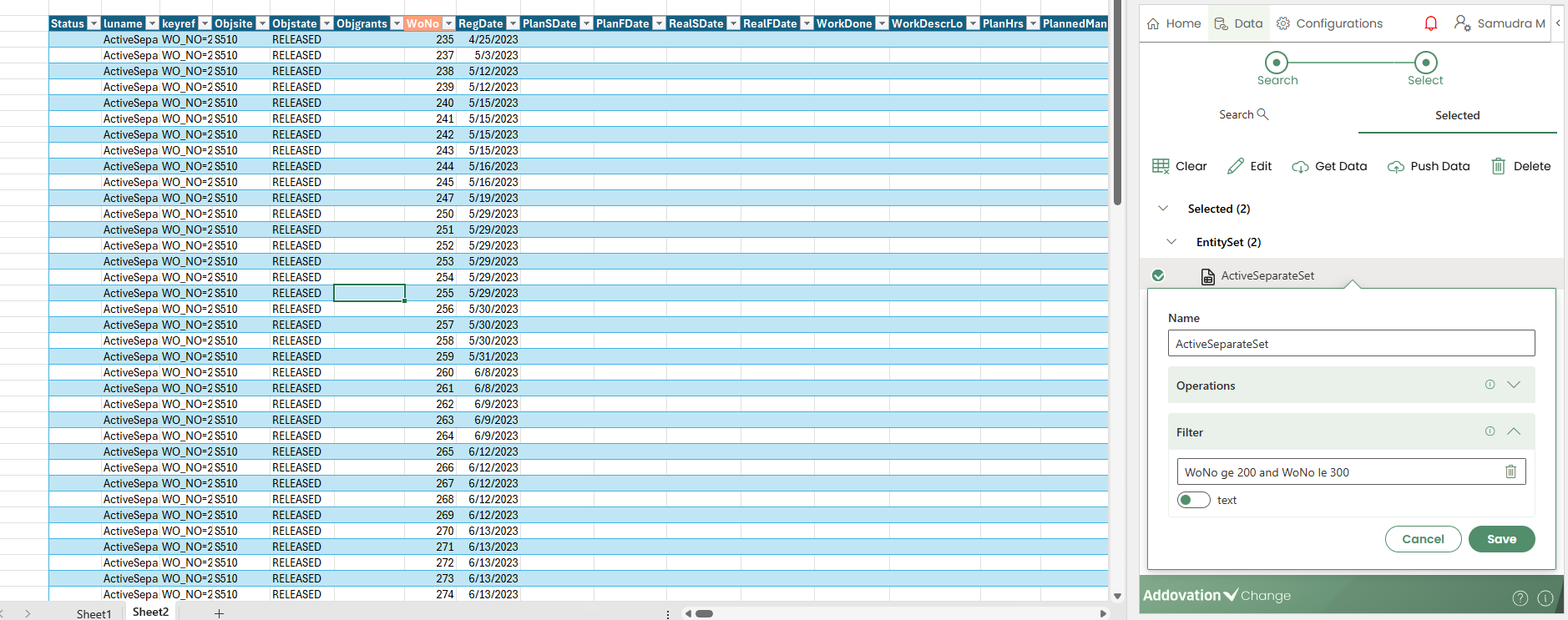
Example 02: CreationDate ge 2020-01-01 and CreationDate le 2020-12-31
- Any value but not blank ones
Example 01: WorkDone ne null and WorkDone ne ' '
Example 02: RequiredStartDate ne null
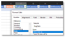
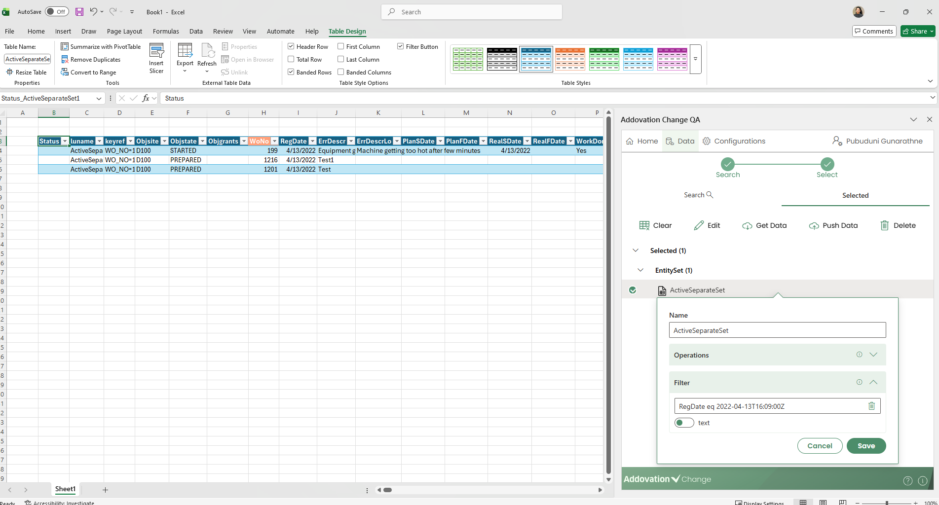
- Date Filter
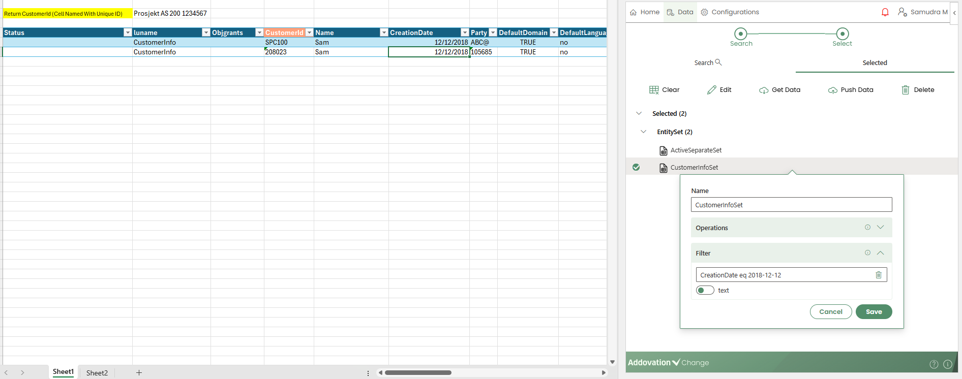
Example: CreationDate eq 2018-12-12
- Date and Time Filter
Example: RegDate eq 2022-04-13T16:09:00Z
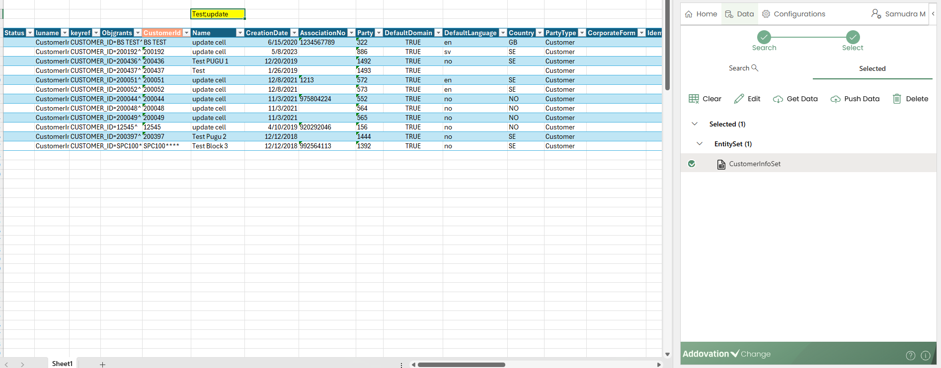
- The text filter also supports multiple filters separated by semicolons. Below are some sample scenarios that demonstrate how the semicolon feature works within the text filter.
- Semi colon support for cell values (one or more terms)
- Semi colon support for cell values with spaces around
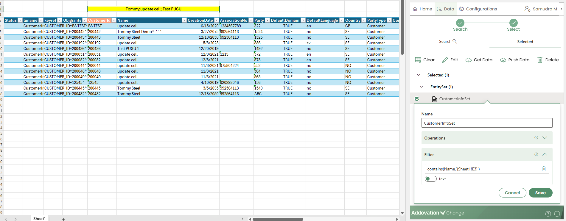
- Reference to multiple cell values with or without semi colons
Entity Set Commands
- A set of commands is available when working with an entity set table. These commands are described below in the order they are displayed, from left to right.

Clear table: Clears data from a table
Edit: Opens Entity set properties dialog
Get data: Populates the table with fetched data
Push data (save): Changes to the table is pushed to the server (add/update/delete)
Delete item: Deletes the selected entity set and the table from the sheet.
Actions
Actions can be added to the workbook either to a table or to a cell outside a table.
Similar to selecting an entity set, the user starts by selecting the projection and then selects the required action.
You can add an action by either double-clicking it or by single-clicking and then selecting Next.
This will take you to the Selected tab and open the action settings.
Action Settings
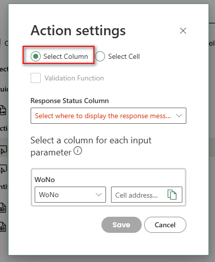
- The action settings dialog is where the table columns/cells and action parameters are connected.
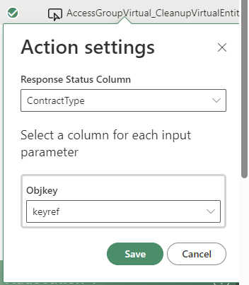
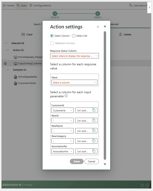
In the
Action Settingswindow, the first step is to choose whether the selected action is connected to atable columnor to acell outside the table.There’s a dropdown menu for each action parameter (Response Status, Response Value and Input Parameter), where the user can pick which column or cell should be connected to the parameter.
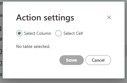
If the
Select Columnradio button is chosen in actions settings window, the action parameter fields allow the user to select columns from the table currently selected in the workbook.
- If multiple tables exist and no cell within the required table is selected, the add-in displays the message
No table selected.
If the Select Cell radio button is chosen, the user must provide a cell address for each action parameter field.
- The user can select a cell directly in the workbook and copy its address using the copy icon.
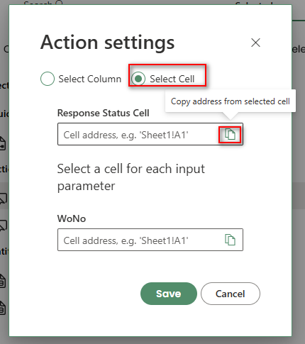
Response Status
The first dropdown in the action parameter selection is for the
Response Status Column/Cell.Entity set tables always include a
Statuscolumn. However, if the table allows Add, Update, or Delete operations, or if another action uses the same status column, it is recommended to add a new column for the action’s status to avoid confusion.
Response Value
The next dropdown is for the
Response Value Column/Cell.This dropdown may be available for some actions and not for others, depending on their configuration.
Once the action is successfully triggered, its output value will be passed to the selected column or cell.
If an action returns multiple values, each response value can be assigned to a separate column. Additional columns can be added to the table and will appear in the dropdown list. There is also an option to skip displaying the response value by selecting the
–option in the dropdown.
Input Parameter(s)
The last set of dropdowns are for providing
input parameters.The values in the selected column(s) or cell(s) will be used as input for the action.
The add-in also allows combining table columns and cell addresses for action input parameters when Select Column is chosen.
If no table column is selected, the add-in will use the value provided in the cell address.
Action Commands
- A set of commands is available when working with actions. These commands are described below in the order they are displayed, from left to right.

Clear table: Clears data from a table
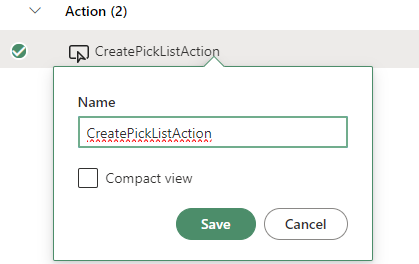
Edit: Opens the action properties dialog to change the display name of the action.
Invoke Action: Invoke the action using parameters from the table/cells.
Delete item: Deletes the selected entity set and the table from the sheet.
Functions
Functions, just like actions can be added to the workbook either to a table or to a cell outside a table.
Similar to selecting an entity set, the user starts by selecting the projection and then selects the required function.
- Double clicking the function item will direct user to the
Selectedtab and open the function settings.
Function Settings
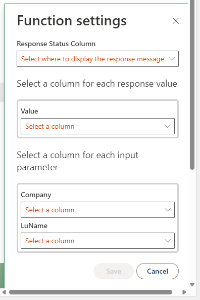
The function settings dialog is where the table columns/cells and function parameters are connected.
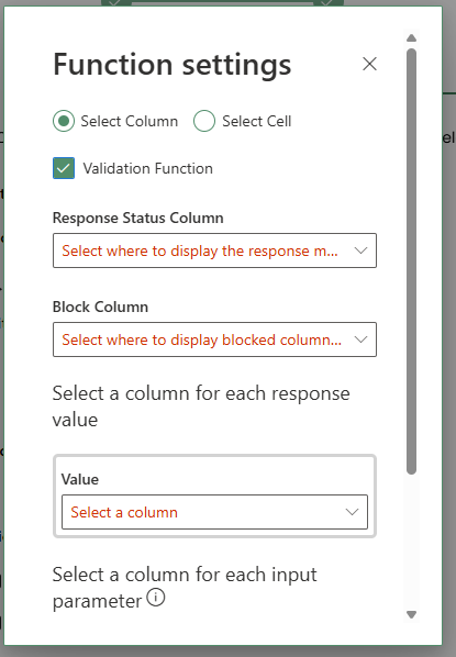
As with Actions, the first step in the Function Settings window is to select whether the function is connected to a table column or to a cell outside the table.
Validation Functions
- For functions, an additional checkbox is available in the Function Settings window that allows users to specify whether the function should act as a validation function.
Important
A function can be selected as a validation function only when the function parameters use table columns.
How it works is as follows:
A Validation Function is a special type of function used to validate records before they are pushed to a projection. It allows you to control whether individual rows should be included or blocked based on a specific column value.
In this mode:
Only rows where the selected Block Column has the value “OK” will be pushed to the projection.
Rows with any other value in the Block Column (for example, “Not OK”) will be blocked and excluded from the projection.
Block Column Selection
- When a function is marked as a validation function, an additional configuration option becomes available.
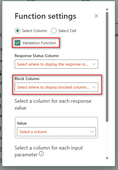
Users can select a
Block Columnfrom a list of columns in the entity set.In most cases, this column is one of the outputs produced by the validation function.
The system evaluates the value of the selected Block Column for each row to determine whether the record should be allowed or blocked.
This mechanism ensures that only records that meet the defined validation criteria are processed further, helping maintain data accuracy and consistency.
Response Status
The first dropdown in the function parameter selection is for the
Response Status Column/Cell.Entity set tables always include a Status column. However, if the table allows Add, Update, or Delete operations, or if another function uses the same status column, it is recommended to add a new column for the function’s status to avoid confusion.
Response Value
The next dropdown is for the
Response Value Column/Cell.This dropdown may be available for some functions and not for others, depending on their configuration.
Once the function is successfully triggered, its output value will be passed to the selected column or cell.
If a function returns multiple values, each response value can be assigned to a separate column/cell.
Additional columns can be added to the table and will appear in the dropdown list.
There is also an option to skip displaying the response value by selecting the
–option in the dropdown.
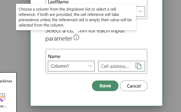
Input Parameter(s)
The last set of dropdowns are for providing
input parameters.The values in the selected column(s) or cell(s) will be used as input for the function.
The add-in also allows combining table columns and cell addresses for action input parameters when
Select Columnis chosen.If both values are provided, the cell reference is used first. However, if the referenced cell is empty, the value is retrieved from the selected column.
Function Commands
- A set of commands is available when working with functions. These commands are described below in the order they are displayed, from left to right.
Clear table: Clears data from a table
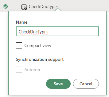
Edit: Opens the Function Properties dialog, allowing you to change the display name of the function. The dialog also includes a checkbox to enable auto-run, which makes the function run automatically whenever the entity is triggered.
Invoke Action: Invoke the function using parameters from the table/cells.
Delete item: Deletes the selected function from the sheet. A confirmation message will appear to get user’s confirmation.
Quick Reports
To add a Quick Report to a worksheet, first select the cell where you want the table to be placed.
Then, double-click the required Quick Report to insert it into the sheet.
Quick Reports are available in the Quick Reports section, where they are grouped by category.
You can also use the search bar to quickly find a report by typing its name.
If a worksheet contains multiple tables, ensure they are placed side by side. Tables must not overlap or be placed on top of one another.
The creator will be directed to the Selected tab and quick report settings dialog will open automatically.
Quick Report Settings
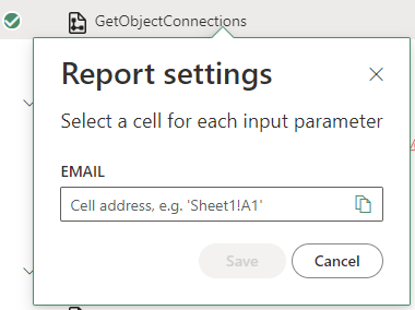
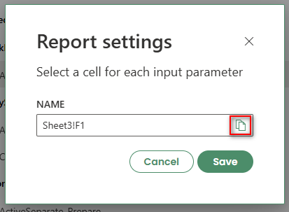
The settings dialog for the quick report is where
input parametersare configured.For each input parameter, an address (cell) from which the parameter value is to be fetched should be entered.
It's also possible to copy the address for the selected cell by clicking the
copybutton in the text field.
Quick Report Properties
- For quick reports, the below properties can be updated.
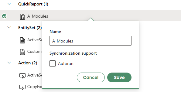
Name
- How the item will appear in the list.
Autorun
Will run the quick report automatically, i.e. clear the table and fetch the data again, when the user signs in to the application.
Synchronization Status, Notifications & Sync
Synchronization Status
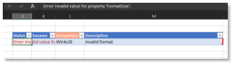
After performing Create, Read, Update, or Delete (CRUD) operations, the result is shown in the
Statuscolumn of the worksheet.A successful operation is indicated by a success status.
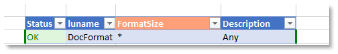
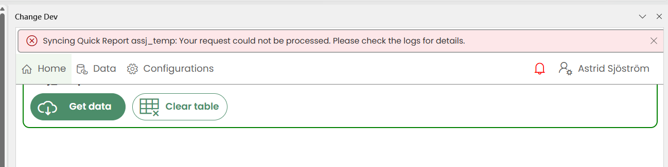
- If an operation fails, an error status is displayed.
Notifications
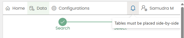
- General errors are shown as notifications at the top of the task pane.
When a new notification is received, the bell icon in the menu ribbon is highlighted in red.
Clicking the bell icon displays all notifications received during the current login session.
Sync Option
- A
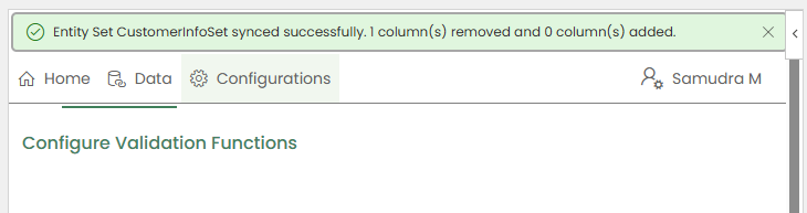
Sync iconappears on the menu ribbon with a notification count when changes are detected from the IFS side for entity sets or quick reports added to the current workbook.
These changes may include adding or removing columns.
The notification count appears as 1 if one or more changes are made to the same entity set or quick report.
The count increases based on the number of affected entity sets or quick reports.
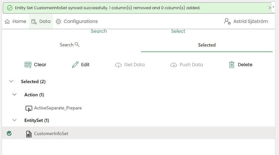
When the user clicks the Sync icon, the workbook table is synchronized with IFS, and the latest updates are applied to the workbook.
After a successful sync, a confirmation message is displayed, indicating the number of columns that were added and removed.
- If a quick report has been completely removed from the IFS side, clicking the Sync icon will not remove the corresponding table from the workbook. Instead, an error message will be displayed to inform the user of the issue.
Configurations Tab
The Configuration tab is where all change-related configurable buttons and options are available.
This tab is only available for template creators.
There are six available tabs:
- Buttons
- Execute Buttons
- Customized Groups
- Merge/Enrich Buttons
- Search LOV
- VBA Buttons
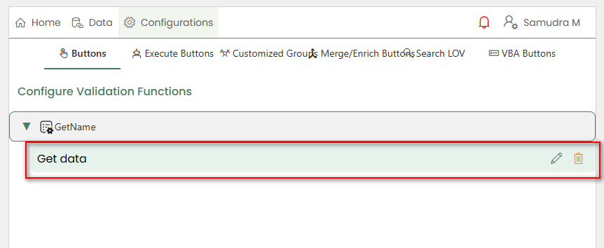
Buttons Configuration
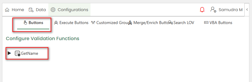
In the Buttons tab:
- A list of available validation functions is displayed.
- When a function is selected, the buttons associated with that function are shown.
- Clicking on a button displays the
EditandDeleteoptions.
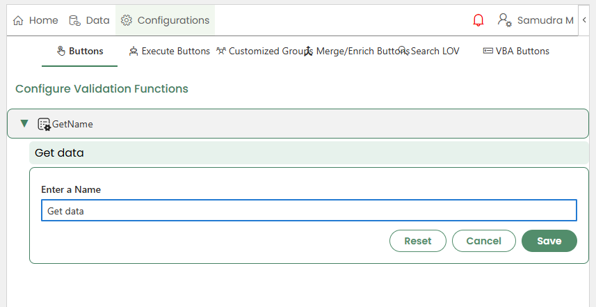
Edit
The display name of the button can be updated.
Clicking
Saveapplies the updated name, while clickingResetreverts the name to the original button name.
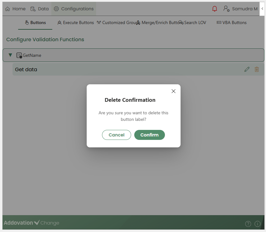
Delete
Clicking Delete displays a confirmation message asking the user to confirm whether they want to delete the button associated with the selected validation function.
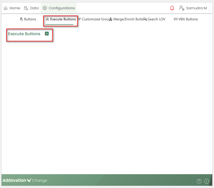
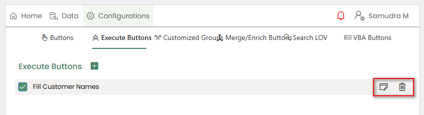
Execute Buttons
The Execute Buttons tab allows creators to add Execute buttons on the homepage for users to invoke.
Creators can configure the following actions for an Execute button:
- Load Data
- Call functions/actions
- Send Data
To add an Execute button, creators can click the
+icon under the Execute Buttons tab.
A new section will expand, allowing the creator to enter the required details.
The first field is used to define the display label for the button.
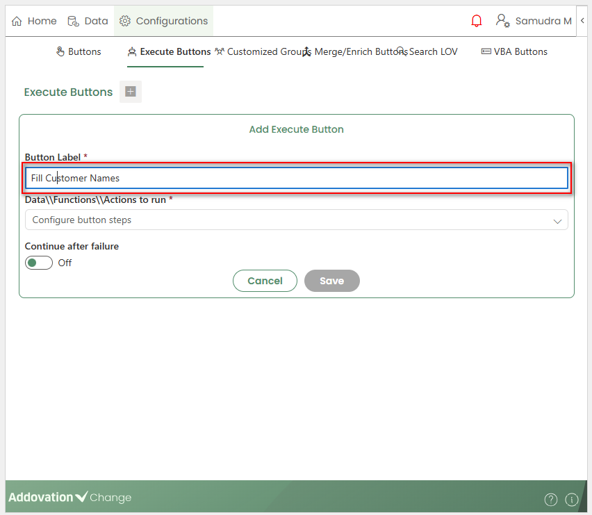
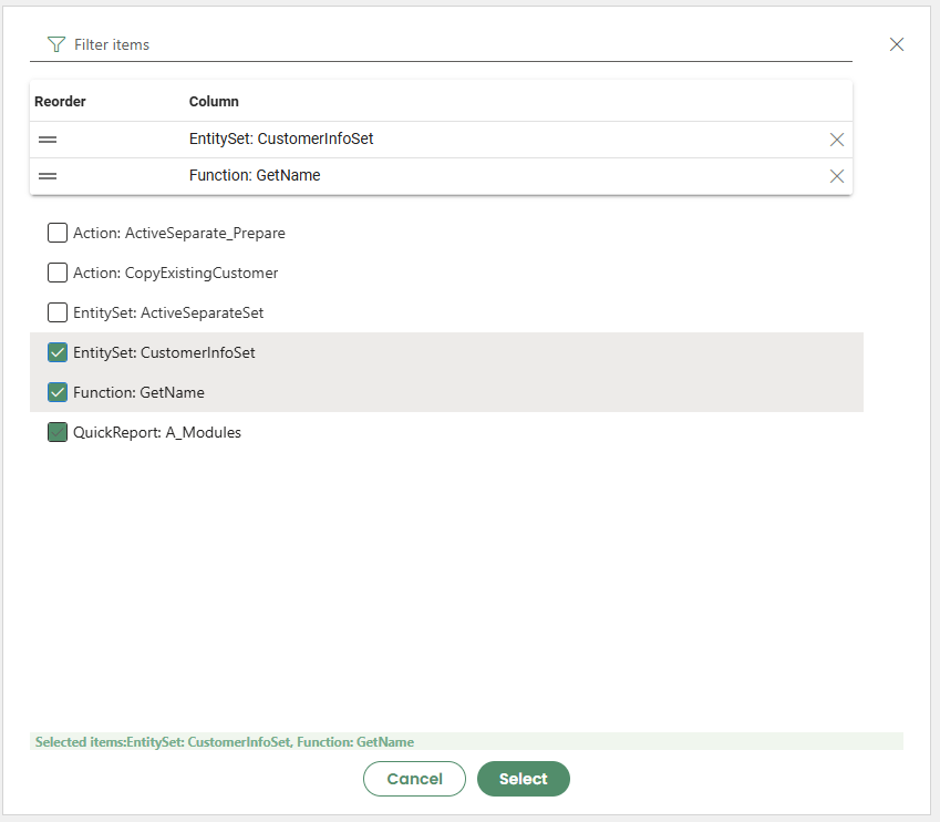
Next, a drop-down list is available that displays the operations defined in the workbook.
Creators can select one or more operations to be executed when the button is invoked, and the order of execution can be adjusted.
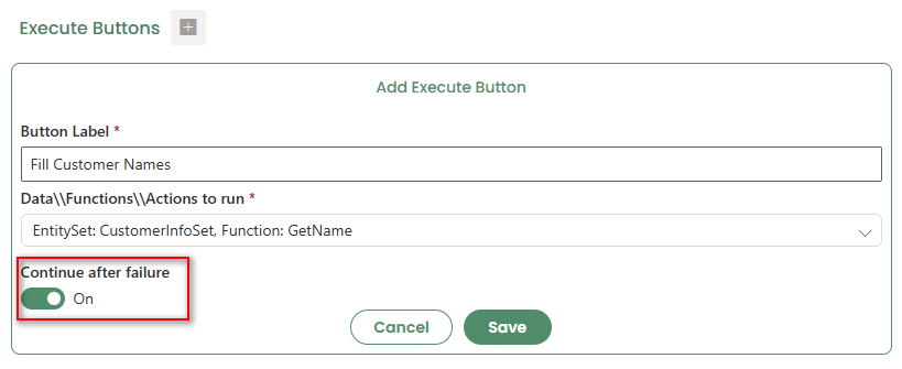
- A toggle option is also available to specify whether the execution should continue automatically after a failure.
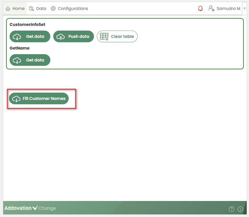
- Once saved, the newly created Execute button will appear on the homepage and will be available for both creators and users to invoke.
The created Execute buttons are listed under the Execute Buttons tab.
When a button is selected, the
EditandDeleteoptions are displayed.
Clicking
Editopens the options window, allowing creators toupdatethe button label,add,remove, orreorderactions, and`turn the toggle option on or off.Clicking
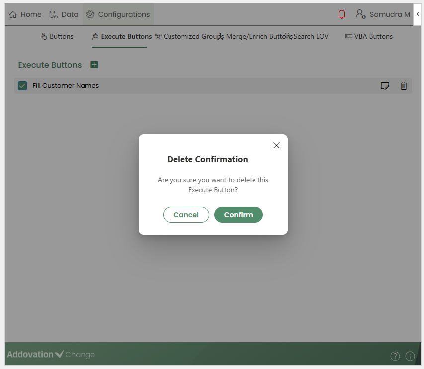
Deleteopens a confirmation pop-up. Once confirmed, the selected button is removed`.
Customized Groups
The Customized Groups feature allows creators to
organizebuttons into custom groups andrearrangethe Home page without using the default button layout.Using customized groups, buttons can be
grouped,renamed,reordered, orhiddenfrom the Home page.The customized view created here is applied to the Home tab. Then users will only see the customized button layout on the Home page.
The Customized Groups tab contains two sections displayed side by side:
- Available Buttons
- My Groups
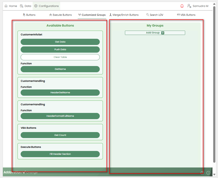
Available Buttons
The Available Buttons section displays a list of
all buttonsadded to the workbook.Each button is shown with its original labe` and is grouped by the connected entity set.
Buttons from this section can be
dragged and droppedinto groups under My Groups.
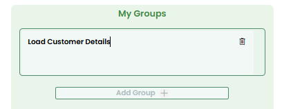
My Groups
The My Groups section displays all
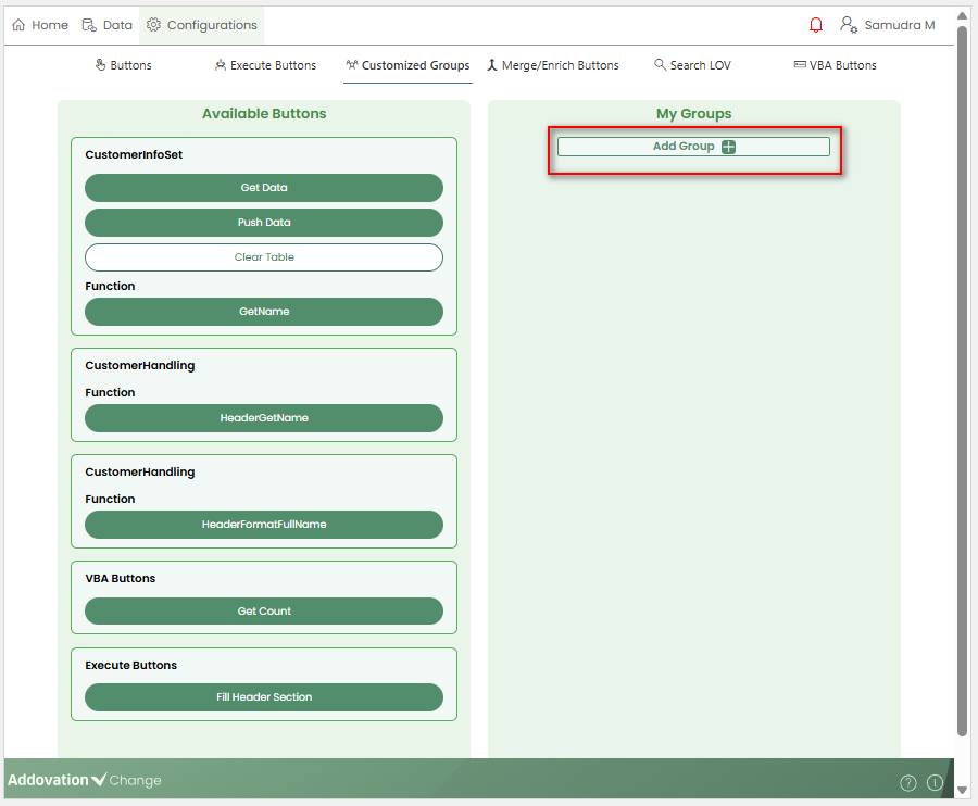
custom button groupscreated by the creator.To create a new group, click the
+icon next to the Add Group label.
- Once a group is created, it includes the following features:
Editable Group Title
The group title can be
edited inline.Clicking the title allows the default name to be changed to a preferred name. This title will be displayed on the Home page as the group header.
Adding Buttons to a Group
Buttons can be added by dragging them from Available Buttons into the group.
Once a button is added to a group, it becomes disabled in the Available Buttons section.
Button Options within a Group
Each button within a group displays:
The current button label with an inline edit option to change the display name
Option to delete the button from the group
Option to reorder the button within the group
Deleting a Group
- An entire customized group can be deleted by clicking the
Deleteicon next to the group title.
Multiple Groups and Home Page View
- Multiple customized groups can be created using the
+Add Group option.
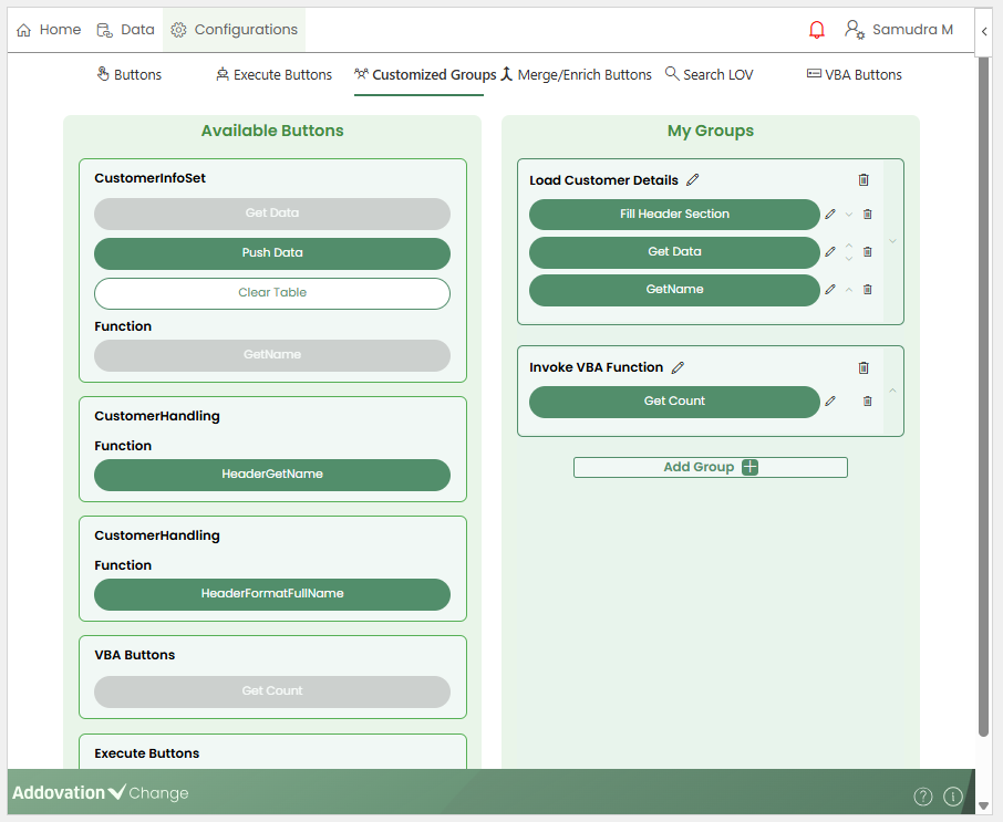
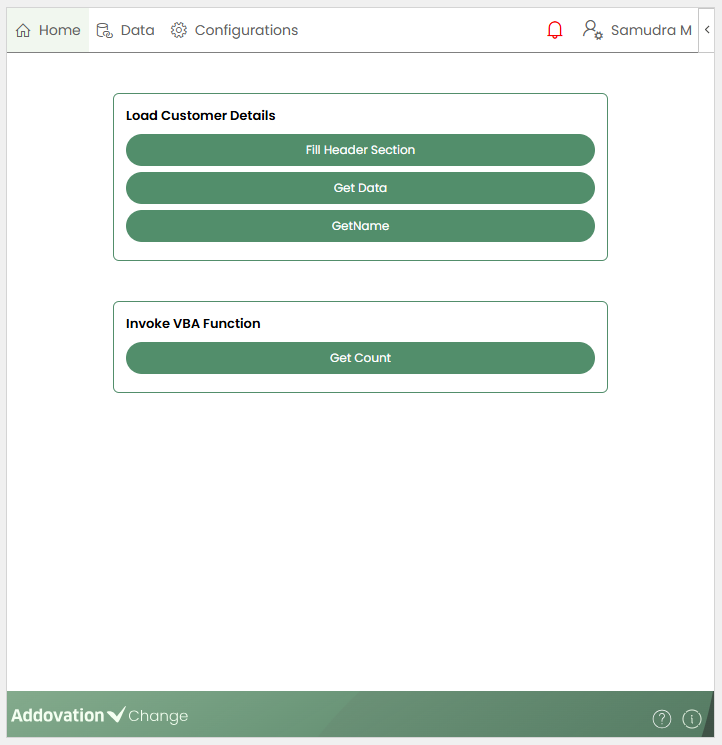
Once customized groups are configured, the default buttons on the Home tab are replaced by the customized groups.
Both creators and users will be able to view and invoke these grouped buttons from the Home page.
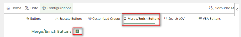
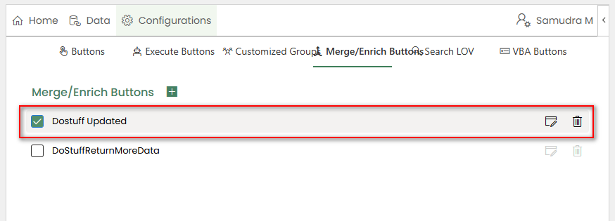
Merge/Enrich Buttons
Merge/Enrich Buttonsallow creators to enhance or combine data from Excel tables using predefined actions.These buttons make it easy to process table data directly from the workbook and return updated or newly generated results back into Excel.
Using Merge/Enrich Buttons, creators can configure actions that:
Enrich table databy updating or adding valuesMerge datafrom multiple tables into a single resultReturn modified versions of the original tables or generate new result tables
Once configured, Merge/Enrich Buttons allow users to run actions with a single click.
Adding a Merge/Enrich Button
- To add a new Merge/Enrich Button, click the
+option at the top of the Merge/Enrich Buttons tab.
- A new section will expand, allowing you to enter the configuration details.
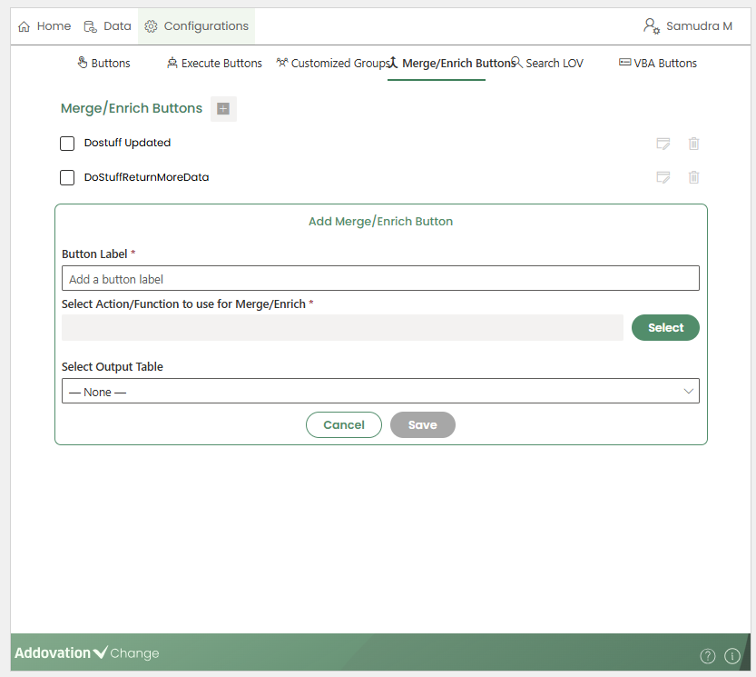
The first field is used to provide a name, which will appear as the button label.
Next, select the relevant action to associate with the Merge/Enrich Button by clicking the
Searchbutton.
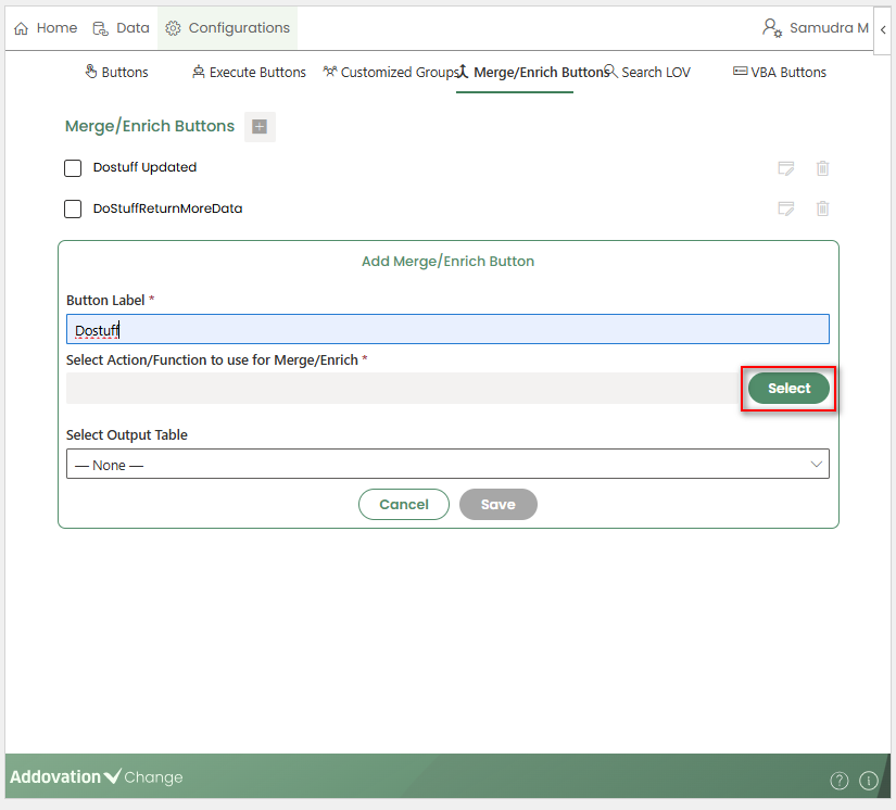
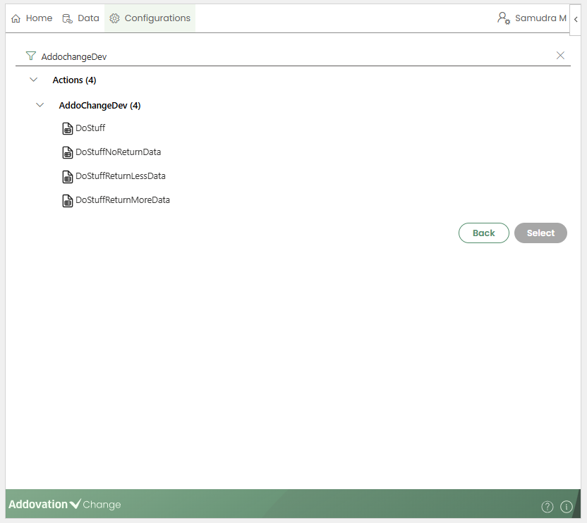
This opens a new window where creators can search for available actions.
From the search results, select the action to be connected to the button.
- Based on the selected action,
Table InputandTable Outputoptions will be displayed.
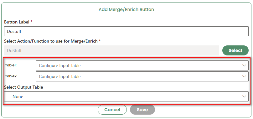
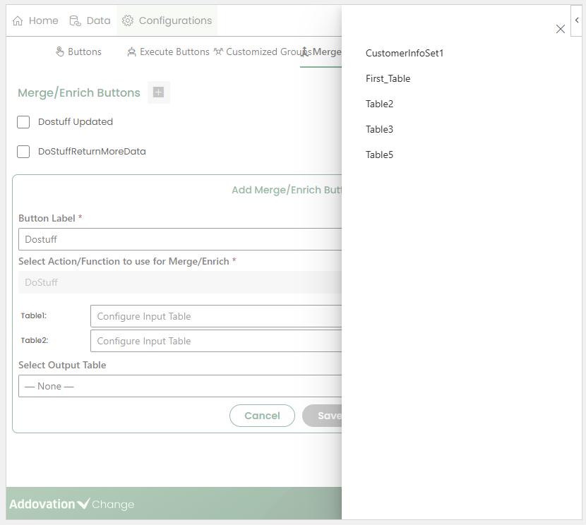
For each input and output field, clicking the drop-down list shows the tables currently available in the workbook.
The required input and output tables may vary depending on how the selected action is configured.
Once all configuration details are completed, click
Saveto create the button.The newly created Merge/Enrich Button will appear on the Home page and can be invoked by users.
Similar to other buttons, Merge/enrich Buttons can also be included inside the customized groups.
Edit/Delete Merge/Enrich Buttons
All created Merge/Enrich Buttons are listed under the Merge/Enrich Buttons tab.
Selecting a button enables the
EditandDeleteoptions.
Clicking Edit allows you to:
Update the button label
Change the connected action
Modify the input and output table selections
Clicking Delete displays a confirmation message. Once confirmed, the selected Merge/Enrich Button is deleted.
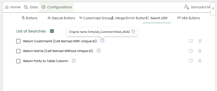
Search LOV
Search LOVs (List of Values) provide users with a searchable list of predefined values that can be selected and populated into a cell or table column.
LOVs can be configured to trigger when a user clicks a
cellortable column.When triggered, a searchable, multi-column results table appears in the Change panel, displaying values retrieved from the configured data source.
Creators can define:
Which fields are displayed in the search results
Optional filters to narrow down the list of values before loading
There are three ways to configure a Search LOV:
Configuring a LOV for a named cell without using a unique ID
Configuring a LOV for a named cell using a unique ID
Configuring a LOV for a table column
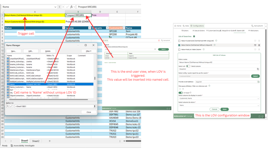
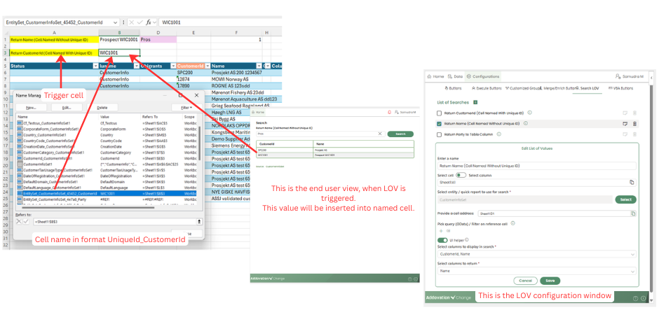
Returning Values to a Named Cell (Without Unique ID)
- When returning values to a named cell, it is mandatory that the target cell is named using the same name as the return column header. This ensures that the selected value is populated correctly.
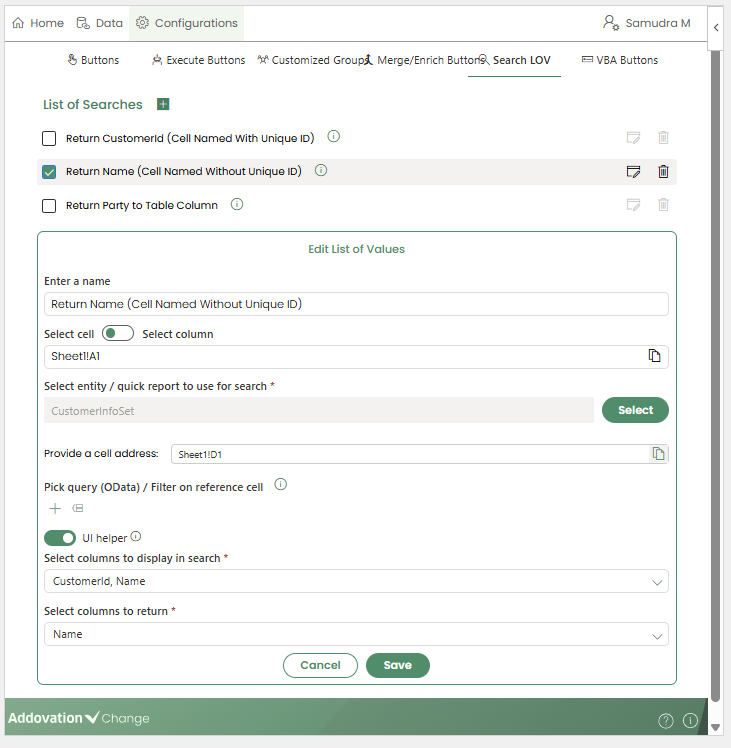
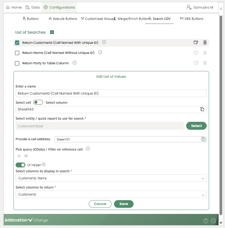
Configuration
Navigate to the
Search LOVtab under Configurations. Existing Search LOVs are listed with options to Edit or Delete.Click the
+icon to create a new Search LOV. This opens the configuration window.Name: Enter a name for the Search LOV. This name will be visible to users.
Select Cell: Select the Select Cell option using the radio button, then specify the cell address where the Search LOV should be triggered.
Select Entity Set or Quick Report: Choose the entity set or quick report to be used as the data source. If a quick report is selected, additional fields will appear to allow entry of the required input parameters.
Provide a Cell Address: If you want to add a predefined filter to the search bar (displayed when the LOV is triggered), you can provide the corresponding cell address here.
Pick Query / Filter on Reference Cell: Apply filters to limit the data retrieved for the search. Both Text Filter and UI Filter options are available, and you can switch between them as needed.
Select Columns to Display: Choose the columns to be shown in the Search LOV results.
- Up to five columns can be selected
- The display order can be rearranged
Select Columns to Return: Specify which columns should be returned to named cells. Multiple return columns can be selected.
Click
Saveto complete the configuration.
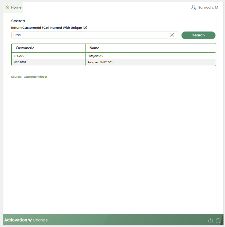
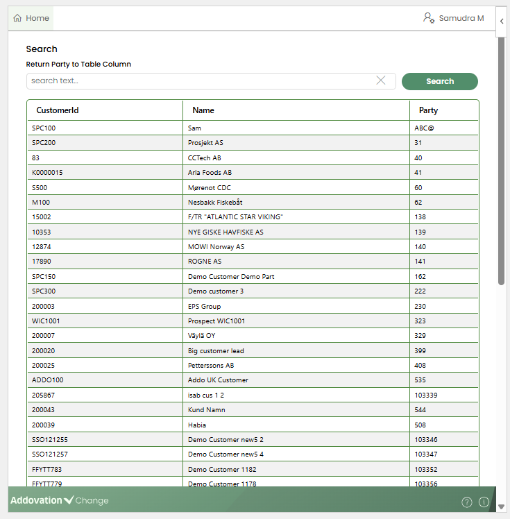
End User Experience
When a user clicks the configured trigger cell, the Search LOV table opens in the Change add-in pane.
The title
Searchis displayed, with the LOV name shown below it.The table displays the columns configured by the creator, with the defined filters applied.
Enter search text in the search bar to filter results if required. If a pre-defined filter criteria is given when configuring the LOV, it will be appeared and the results will be filtered automatically.
Then user selects a record from the list.
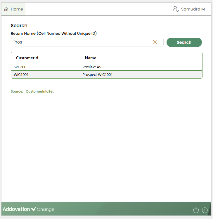
After selection:
The add-in searches for a named cell that matches the return column name.
If a match is found, the corresponding value is populated in that cell.
If multiple return columns are configured, the add-in searches for multiple matching named cells and populates them accordingly.
If no matching named cell(s) is found, that attribute is skipped.
Returning Values to a Named Cell (With Unique ID)
Each Search LOV is assigned a unique ID when it is created.
This unique ID can be viewed and copied by clicking the Info icon next to the LOV name in the Search LOV list.
The unique ID is used to avoid conflicts when multiple Search LOVs return the same column values to different locations. In such cases, naming multiple cells using only the column header can cause issues when identifying where each value should be populated.
To address this, the target cell should be named using the format,
UniqueID_ColumnName.For example, if the return column is Name and the LOV unique ID is LOV123, the cell name should be LOV123_ItemCode.
Configuration
The configuration steps for this scenario are the same as those described in Returning Values to a Named Cell (Without Unique ID).
No additional setup is required, other than naming the target cell using the UniqueID_ColumnName format to receive the returned value.
End User Experience
When an end user triggers the Search LOV and selects a value from the list:
The add-in identifies the unique ID of the triggered LOV.
It searches for named cells that match the UniqueID_ColumnName format.
The selected values are then populated into the corresponding named cells.
- This approach ensures that values are returned to the correct cells, even when multiple Search LOVs are used within the same workbook.
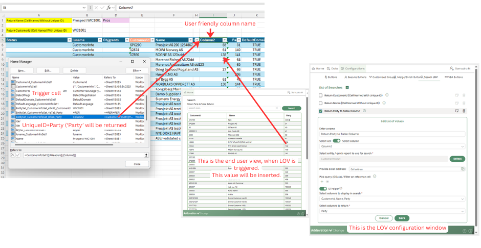
Returning Values to a Table Column
When returning values to a table column, the
trigger/target columnmust be mapped using apersistent referencein the Name Manager.This mapping combines the
LOV unique IDand thereturn columnname similar to how named cells are configured.Using a persistent reference ensures that changes to the column header do not affect the LOV configuration, as the persistent reference remains unchanged even if the visible column name is updated.
Configuration
The overall configuration remains the same as in previous scenarios.
In the LOV configuration, select Select Column using the toggle and then choose the table column that should act as the trigger/target column.

End User Experience
When a user clicks any cell within the configured trigger column, the Search LOV table opens in the Change add-in pane.
The user selects a record from the list of values.
If the identifier matches, the selected value is populated into the clicked cell.
If no matching identifier is found, the attribute is skipped.
VBA Button
The VBA Buttons tab allows creators to add VBA buttons to the Home page for users to invoke.
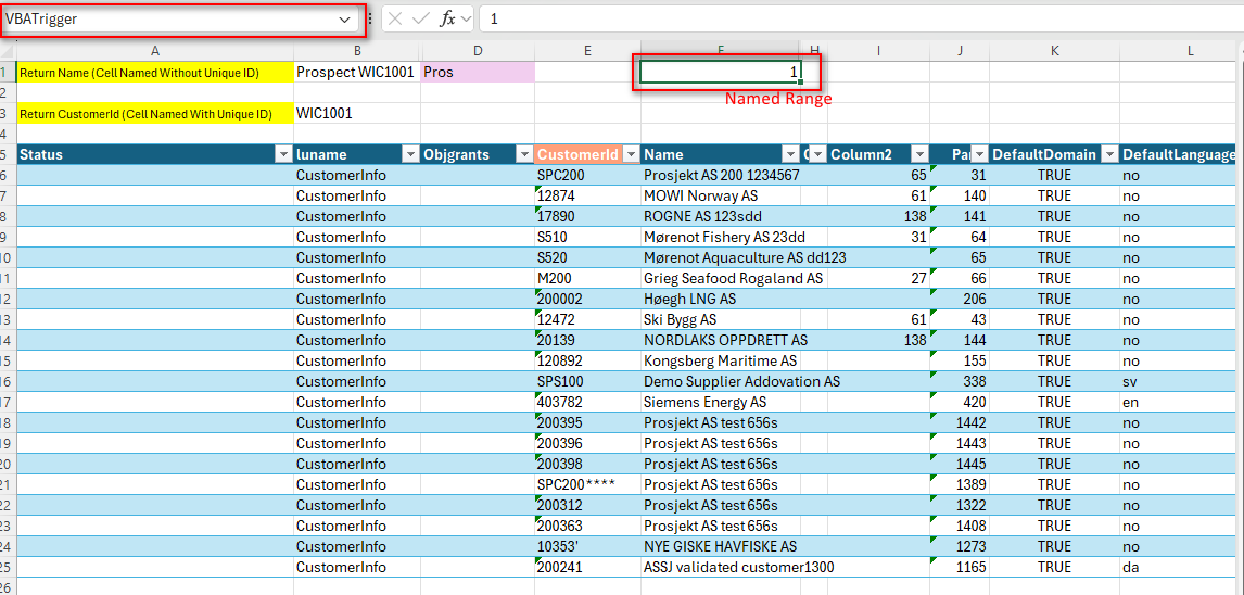
When a VBA button is clicked, the associated named range is updated.
Multiple VBA buttons can be created, each targeting a different named range. Creators can customize both the button label and the target named range.
Adding a VBA Button
- To add a VBA button:
- Click the
+icon under the VBA Buttons tab. A new section expands to capture the configuration details.
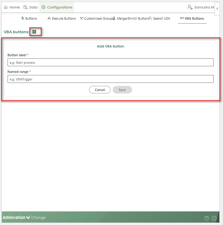
Enter a display label for the button.
Select the target named range to be updated when the button is invoked.
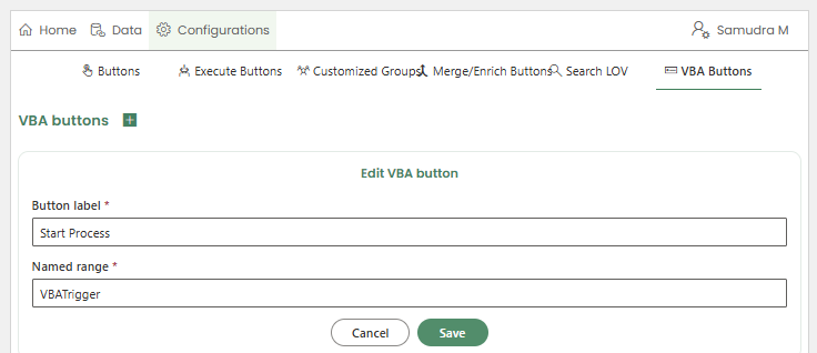
- Click Save to complete the configuration.
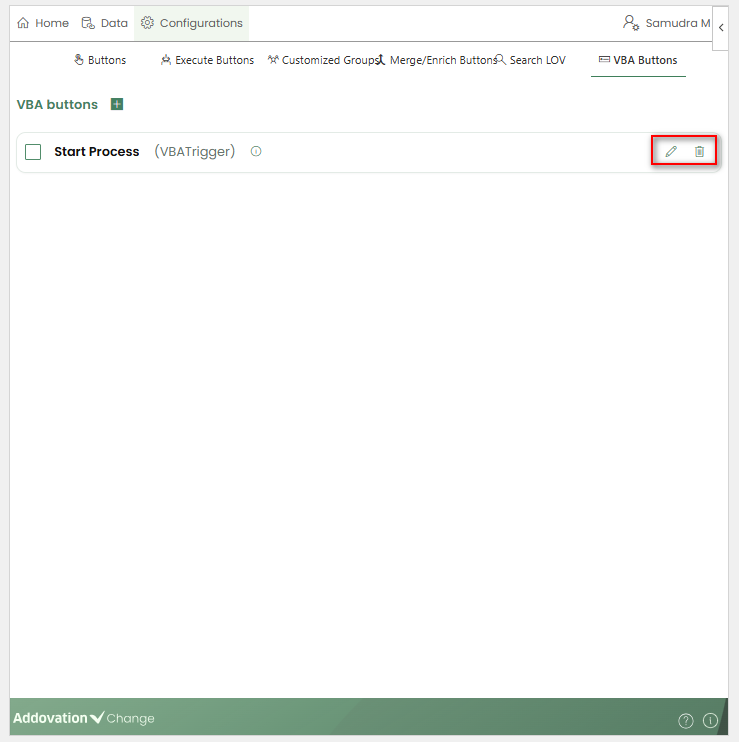
Once saved, the newly created VBA button appears on the Home page and is available for both creators and users to invoke.
Editing and Deleting VBA Buttons
All created VBA buttons are listed under the VBA Buttons tab. Selecting a button displays the Edit and Delete options.
Edit: Opens the configuration window, allowing creators to update the button label or change the target named range.
Delete: Opens a confirmation pop-up. Once confirmed, the selected VBA button is removed.
User Account Tab
- Clicking the User Account tab allows users and creators to sign out of the application when they are signed in.