User Guide - Addovation Go - V3.0
Last Updated: 2025-02-14
Introduction
Addovation Go provides a highly secure, fully integrated and fully flexible mobile app platform with IFS Cloud. It’s possible to create mobile apps covering any business process in IFS Cloud.
For example, Service management process. Using QR codes on all equipment objects, personnel can easily access information, document, repair/maintain, and report status back to process owners.
By using the Addovation Go designer, users can maintain Customers, Users, Themes, Document Management, Applications, Pages, Risk Libraries and Presentation Objects.
Addovation Go supports a variety of UI and data controllers, so it’s possible to design the apps with any layout and any functionality that the customer wishes.
Architecture
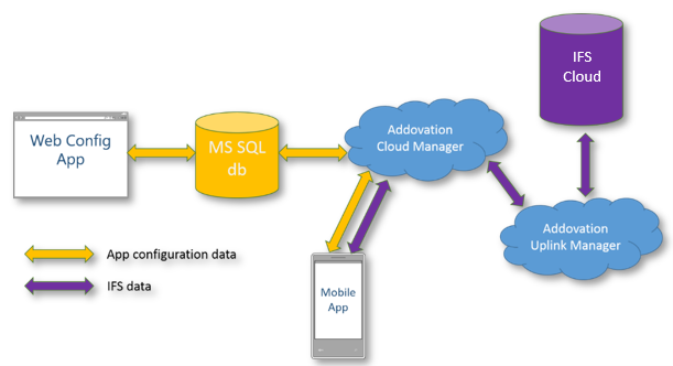
Figure 1 :High level architecture
Application Configuration Flow
Users can create many applications & each application can have several pages. Also, each page can have several rows but Maximum two columns for each row. After adding a row or column to the application, users can drag tools (columns, text boxes, labels, buttons or panels) to each & every row or column.
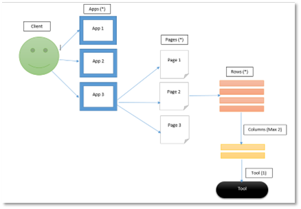
Figure 2 : Application configuration flow
Settings
Customers
Click ‘ Settings’ → ‘ Customers’ to navigate to the customer list

Figure 3 : Navigate to customers
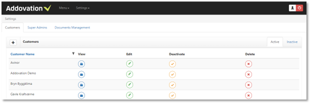
Figure 4 : Customers list
Super Admin/Admin can create, update, delete, active/de active customers.
Create New Customer
By clicking ‘+’ button in the header and provide ‘Customer Name’ and click on ‘ Create’ button to create a new customer.
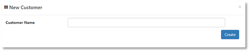
Figure 5 : Create customer
View Customer
Click on the ‘ View’ button to view customer details including Environments, Users, Themes etc.
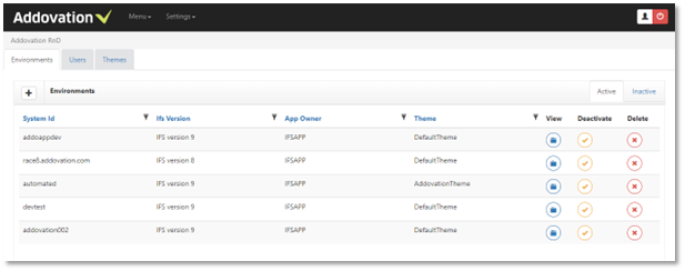
Figure 6 : Customer details
Environments
Customers may have environments. Only the Super Admin/Admin can create, delete, activate/de-activate environments.
Create New Environment
By clicking ‘+’ button in the header and provide system Id(mandatory), IFS version, Main Title, App owner, Font details (Font Name, Font Size), Hide settings, Hide SSO, Service mode and click on ‘Create’ button to create an Environment.
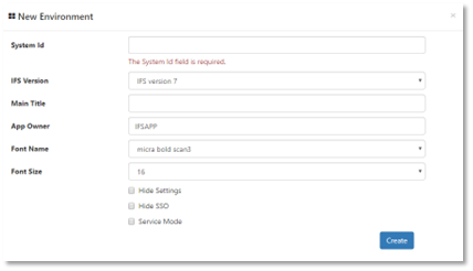
Figure 7 : Create environment
View Environment
Click on the ‘View’ button of an environment, to navigate to the environment details. An Environment may have Applications, Risk Libraries, Presentations Objects. (Functionalities are discussed later in the document).
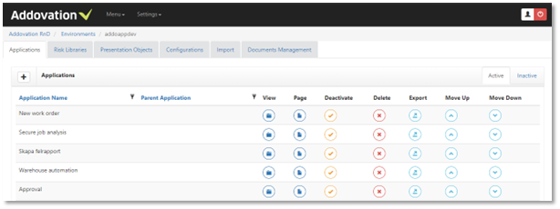
Figure 8 : Environment details
Users
Customer may have users. Super Admin/Admin can add, edit, delete users.
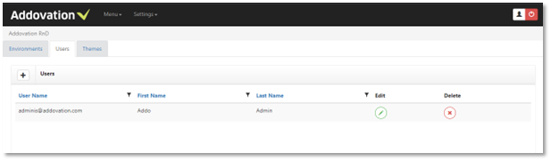
Figure 9 : User list
Create New User
Click on the ‘+’ button in the header and provide;
- User Name (mandatory) – user name should contain @ and **.com (ex: addovation@abc.com).**
- First Name
- Last Name
- Password- Password should contain characters, numbers and at least one special character (ex: Pa$$word123)
- Confirm password
- User role (Admin, Super user, user)
- User environment (which related to the customer)
and click on ‘ Create’ button to create a user.
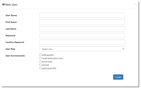
Figure 10 : Create new user
Configurable Themes
Customers can create and design theme/s to use in the mobile client.
Go to the ‘Themes’ tab by Clicking the ‘Menu’ dropdown & click on the specific customer (e.g.: Addovation)
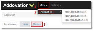
Figure 11 : Themes tab
Using Themes tab, user can Edit, Deactivate, Delete, Import & Export themes.
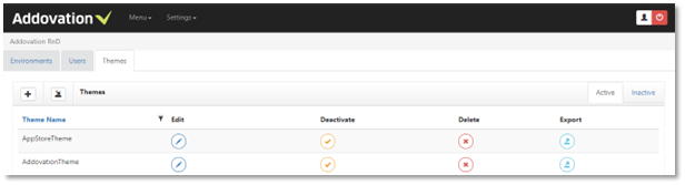
Figure 12 : Theme list
Create New Theme
By clicking on ‘+’ button you can go to the create and theme design page.
Provide the Theme Name & change the theme configurations on each tab. (Splash, Loading, Login, Menu, Tools, Icons etc.) & click ‘Save’.
Initially it displays default values for each property. User can have the option to edit them as they need.
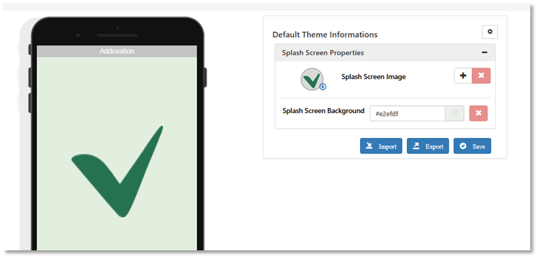
Figure 13 : Create new theme
Theme properties
Splash screen
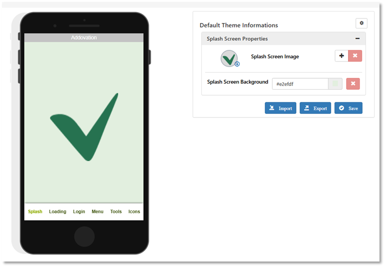
Figure 14 : Splash screen
- Theme Name: To provide a new name or edit an existing name of the theme.
- Splash Screen Image: To set up an image to load as a splash when loading the application in the mobile.
- Splash Screen Background: To set up a color to the splash screen.
Loading Screen
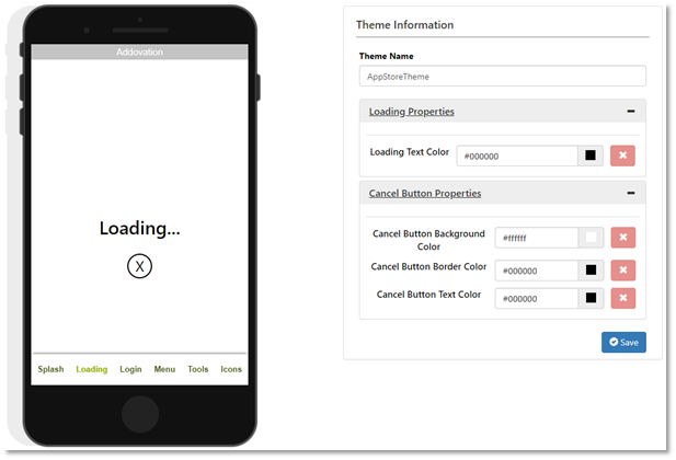
Figure 15 : Loading screen
- Loading Text Color: To set up the color to the loading text
- Cancel button properties: To set up the Background, Boarder & Text color to the cancel button on loading screen.
Login Screen
- Page Properties: To set up a background color to the main page & other pages in mobile client.
- Logo Properties: To setup the logo image in login screen of the mobile client.
- App Name Properties: To set up the application name text color.
- Cloud Status Properties: To set up the cloud status image.
- Text Box Properties: To setup the Textbox properties in the login screen & other pages.
- Button Properties: To setup the button background, border & text color in login button & other buttons appeared in Addovation Go Designer applications.
- Privacy Link Properties: To set up the privacy link color.
Menu Screen
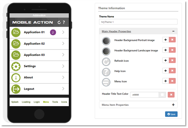
Figure 16 : Menu screen
- Main Header Properties: To set up the mobile client header background portrait image, landscape image, refresh icon, help icon, & header title text color & menu icon
- Menu Item Properties: To set up the mobile client main page icons & color properties.
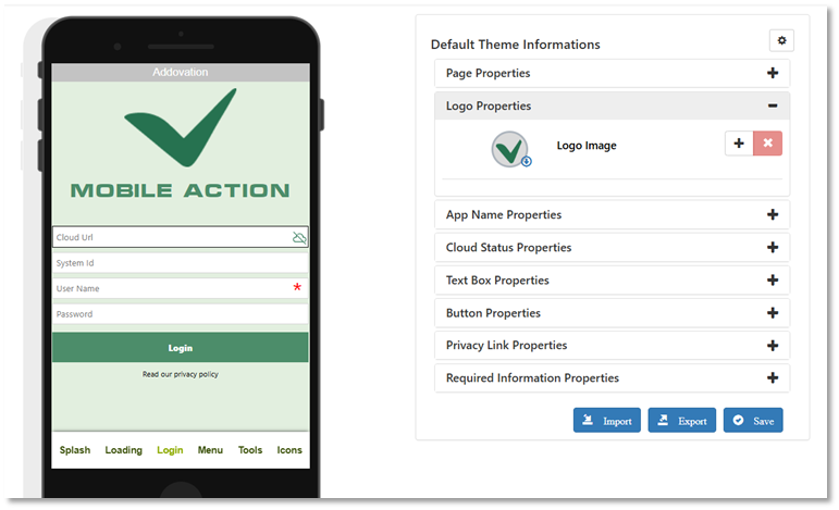
Figure 17 : Login screen
Tools Screen
- Page Title Properties: To set up the application page title icons & colors.
- Label Properties: To set up the Label Text color.
- Email Properties: To set up the Email icon.
- Disable Button Properties: To set up the disable button background, border & text color.
- Footer Panel Properties: When it is a list page & list panel, this is to set up the page footer background color, footer button background, footer button text color & the footer top line color.
- Custom Line Properties: To set up the custom line color.
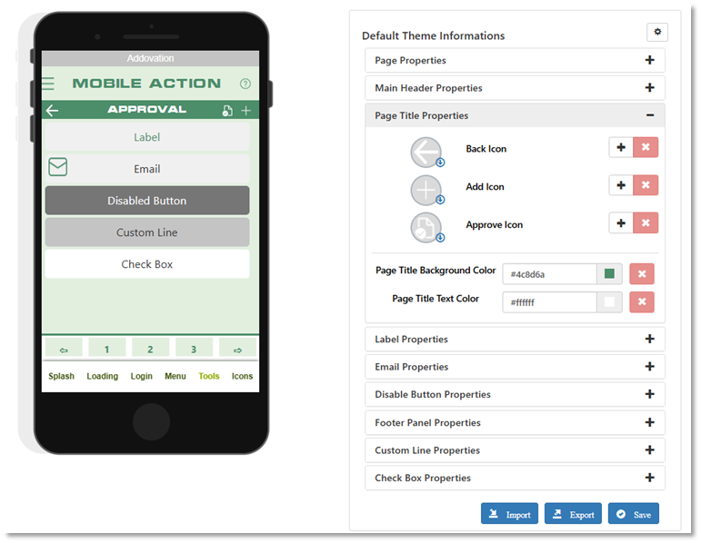
Figure 18 : Tools screen
Icons Screen
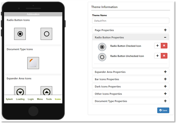
Figure 19 : Icons screen
- Radio Button Properties: To set up the radio button checked & unchecked icons of the mobile client.
- Expander Area Properties: To set up the expander collapsed & expanded icons of the mobile client
- Bar Icons Properties: To set up the bar about & settings icons of the mobile client.
- Dark Icons Properties: To set up the dark about, logout & settings icons of the mobile client.
- Other Icons Properties: To set up the cancel, disable, element mark, enable, folder, gps, configuration document, details document, call, close, search, alternate logo, remove & separator for button icons of the mobile client.
- Document Type Properties: To setup the documents type icon.
Default Theme Configurations
User can set up a ‘Default Theme’ by clicking on ‘Settings’ and then ‘Default Theme Config’ so that user can use that theme unless they need a new theme.
Here you can set up the default theme by changing the theme property values on each tab (Splash, Loading, Login, Menu, Tools, Icons) & click ‘Save’.
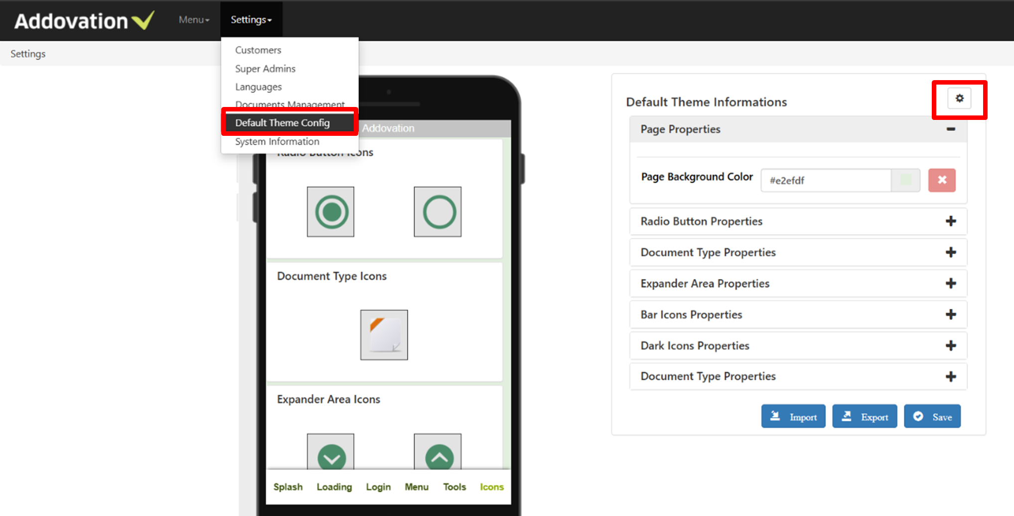
Figure 20 : Default theme configuration
Language Support Text Translations
Addovation Go is support multiple languages. English is the default language. Default langauge has restricted for editing. Norwegian & Swedish languages have added in the Addovation Go Designer Designer. Users can Add other new languages in Languages tab.
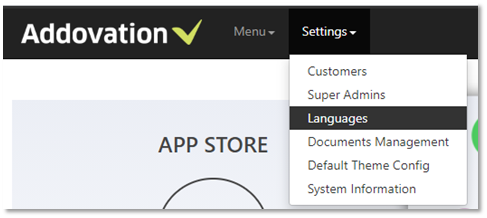
Figure 21 : Languages tab
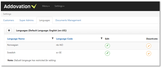
Figure 22 : Languages
A new language can be added by clicking on ‘+’ button. Need to enter the Language Name & Language Code.
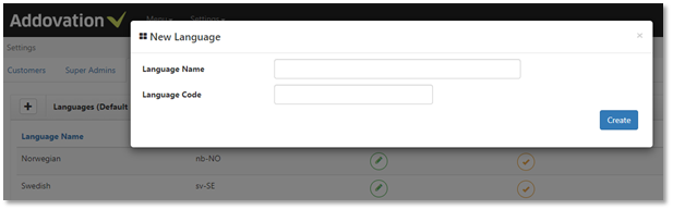
Figure 23 : Add new language
Users can edit each language’s , Language Name & Language code. Furthermore, users can Deactivate or Activate each languages from Designer.
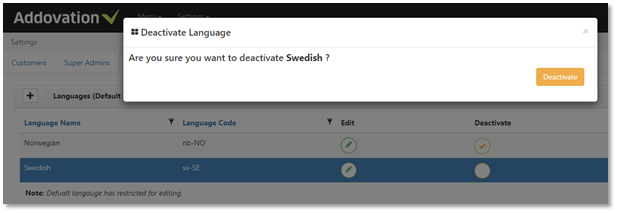
Figure 24 : Deactivate language
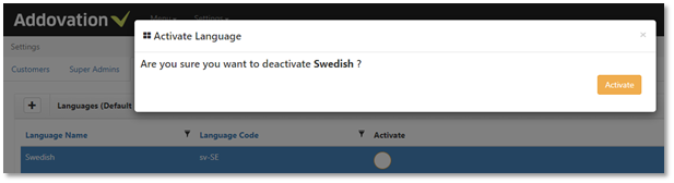
Figure 25 : Activate language
Text Translation features in Designer page design
Text Translation support is available for each & every tool in Designer.
Language support text should be represented within '[' and ']' brackets as shown in below image.
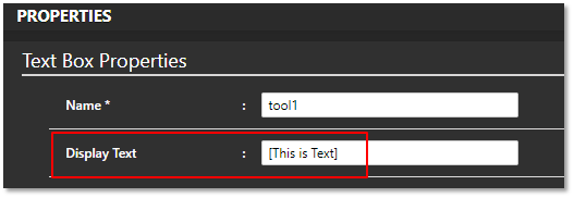
Figure 26 : Text translations for display text
Single words such as [text] or sentence such as [This is a sentence] or multiple text such as [Hello] [World] or combination of both translated text and regular text such as '[Welcome] [to] Addovation' is supported.
If closing bracket doesn't imply then entire text is considered as translated text such as '[This is a none closing bracket'
If translated text does not exist in database, then it will be added as a new text only for default language. Later user can update other languages.
Text prediction is available for display text & placeholder.
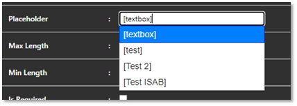
Figure 27 : Prediction text
Features available for maintaining language support
Text Translations are different for each customers. On the ‘Menu’ tab by click on the ‘Customer’ users can go to the ‘Text Translations’ tab.
Users can Select each Languages by clicking on below drop down in Text Translations tab.
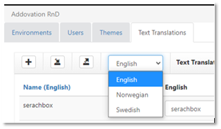
Figure 28 : Select the language
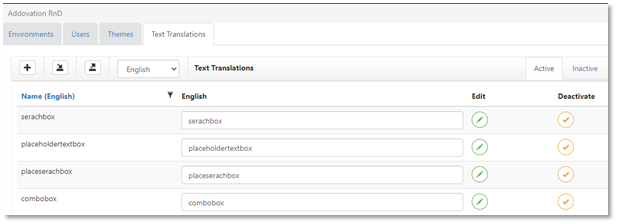
Figure 29 : Translations for selected language
Add new language text
Users can add new text by clicking on ‘+’ button.
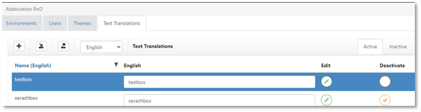
Figure 30 : Add new text
Now enter the text & click on ‘Create’.
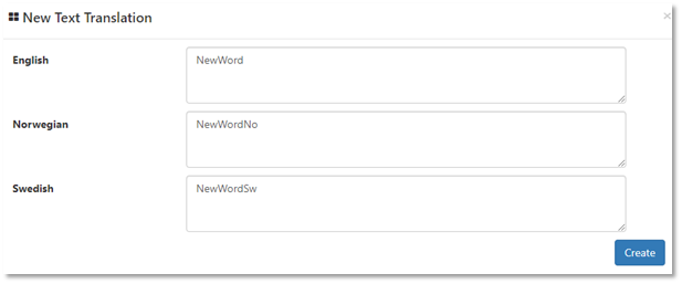
Figure 31 : Create new text
Edit language text
By clicking on ‘Edit’ user can edit each text.
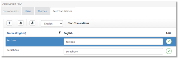
Figure 32 : Edit text
Change the text & click on ‘Update’.
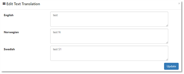
Figure 33 : Update text
Deactivate language text
User can click on Deactivate icon to deactivate each text. Then it will move to Inactive tab.
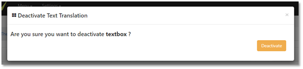
Figure 34 : Deactivate text
Activate language text
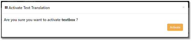
Figure 35 : Activate text
Update all text in the page at once
User can edit all the texts in the page for selected language & can update by clicking on ‘Update Page’.
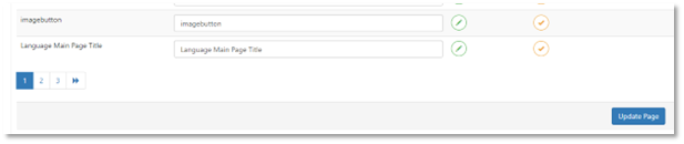
Figure 36 : Update page
Validate empty text for default text (En-Us)
User must enter a value for English text before Click on ‘Create’.
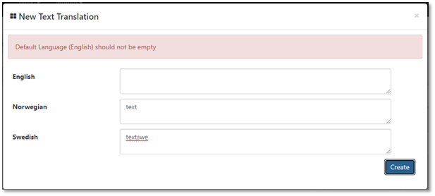
Figure 37 : Validate empty text
Validate text duplication within same language
It’s not possible to enter duplicate Text.
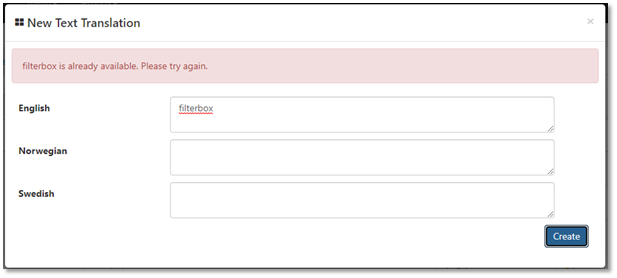
Figure 38 : Validate text duplication
Text Translations support is also available for below,
- Environment Main Title
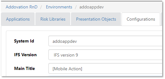
Figure 39 : Environment title
Application Name
Main Page Title
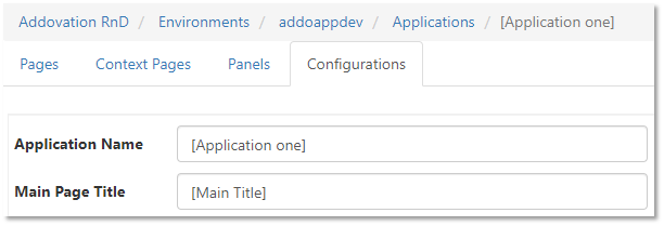
Figure 40 : App name & title
Text Translations support from mobile app
User can change the langue from settings page.
Super Admins
Only Super admins have access to create, edit and delete other super admins.
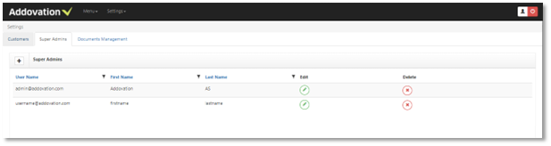
Figure 42 : Super admin list
Create New Super Admin
Click ‘+’ button in the header and provide
- User Name (mandatory) – user name should include @ and **.com (ex: addovation@abc.com).**
- First Name
- Last Name
- Password- Password should contain characters, numbers and at least one special character (ex: Pa$$word1)
- Confirm password and click on ‘Create’ button to create a Super Admin.
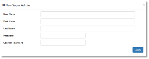
Figure 43 : Create super admin
Document Management
Super admins have access to create, edit, assign and delete documents. Go to ‘ Settings’ - > ‘Document Management’.
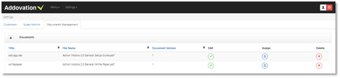
Figure 44 : Document list
Create New document
Click ‘+’ button in the header and provide Title, document version, work state (none/work in progress/ Approved) and choose a file(.pdf) and click on ‘ Save’ button will create a document.
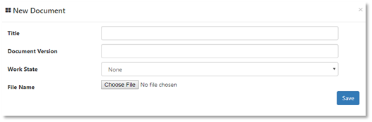
Figure 45 : Create document
Assign document
Super admin can assign documents to environments by clicking button. Here one document can assign to several environments.
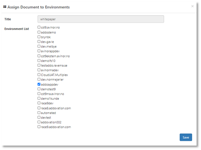
Figure 46 : Assign document to environments
System Information
Users can view several information regarding the Addovation Go components.
Go to ‘ Settings’ - > ‘Document Management’.
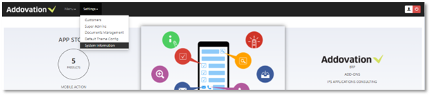
Figure 47 : System information tab
Some important information is visible as follows
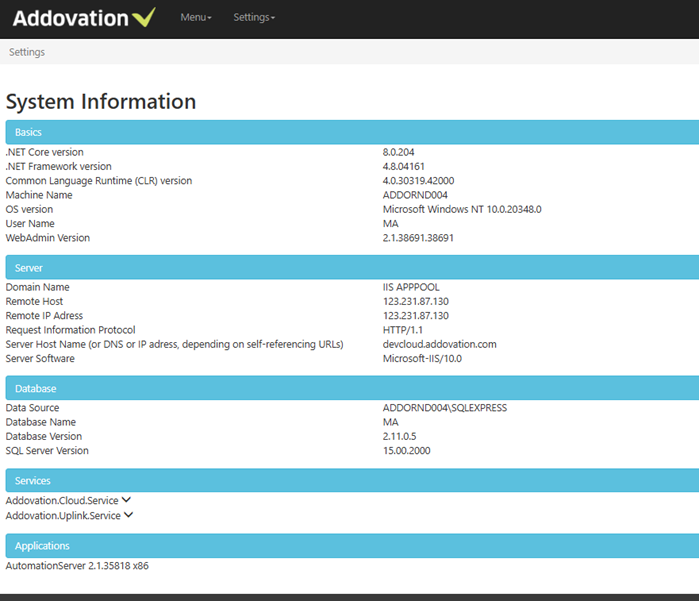
Figure 48 : System information
Security Settings in Designer
There are several defined user access levels (super administrator, administrator, super user & user) to be used in the Addovation Go.
In the user registration page ‘User Role’ dropdown will select the user level other than super Administrator.
- Super Administrator: All operational access to every customer, environment, application, page and risk library.
- Administrator: All operational access to one customer and can access environments, applications, pages risk libraries relevant to that specified customer.
- Super users: All operational access to applications, pages risk libraries.
- Users: All operational access to applications, pages.
How to create an Application & Pages from Designer
Step 1: Login to the Addovation Go Designer.
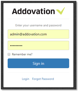
Figure 49 : Login
Step 02: Click on the ‘Menu’.

Figure 50 : Select menu
Step 03: Ex: Click ‘ Customer’ - Addovation RnD → 'Environment' - addoappdev. Then you will be navigated to the applications list.
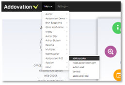
Figure 51 : Application list navigation
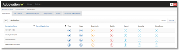
Figure 52 : Application list
Here you can add, edit, export, activate/deactivate or delete applications with these buttons.
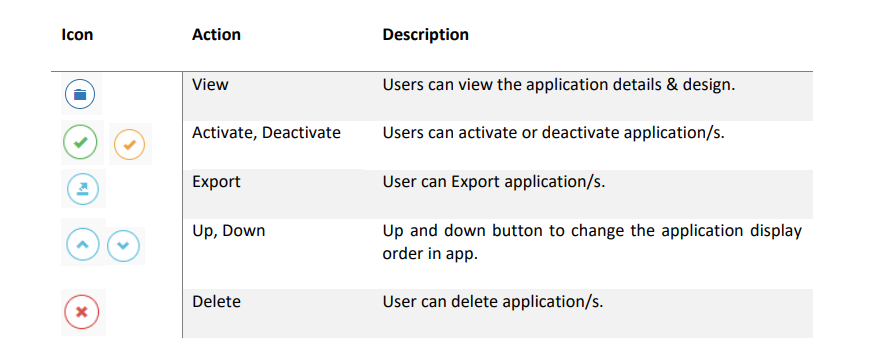
Table 1 : Actions
User can edit application/s by clicking ‘Application’ View → click on the 'Configurations' Tab.
Step 04: Create a New Application
To create a new application, click on '+' button.
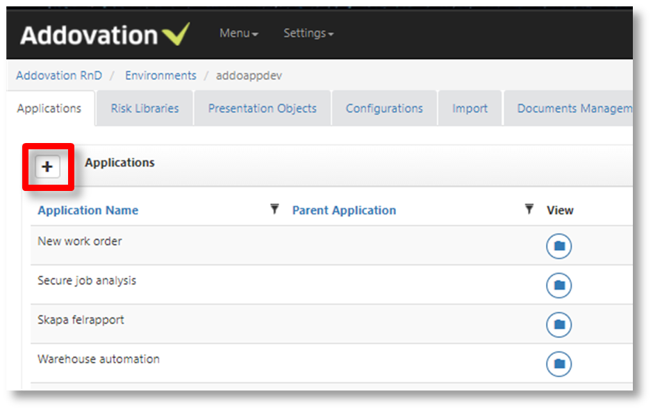
Figure 53 : Add new application
Step 05: Enter Application Name(mandatory), Main Page Title, select the Font Size, Parent App and IFS User Groups. Now click on ‘Create” button.
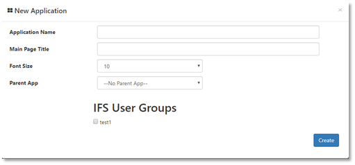
Figure 54 : Create new Application
Step 06: Once the application is created, it will be added to the ‘Active’ Application list. By clicking on the View button user can see the application details. Ex: pages, context pages, panels and application configurations. Default page has automatically added to the page list with title given in the ‘Main Page Title’ field in the application creation or as ‘Default Page’.
Here user can add, Edit, Export, activate/deactivate or delete pages as same as in the application level.
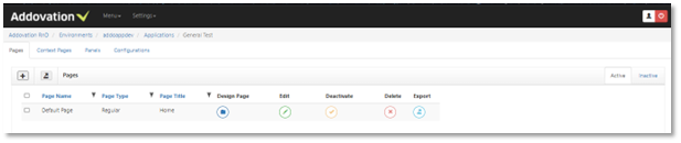
Figure 55 :Application details
User can edit application/s by clicking ‘Application’ View → click on the 'Configurations' Tab.
Step 07: Create a page
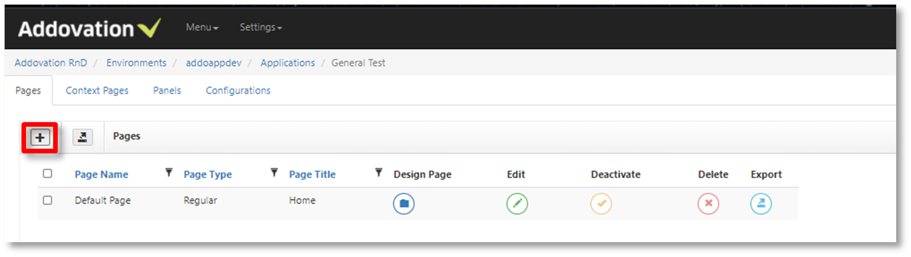
Figure 56 : New Page
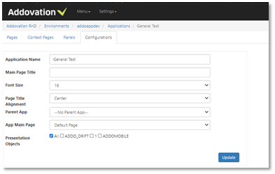
Figure 57 : Application configurations
Enter ‘Page Name’(mandatory), ‘Page Title’, ‘Page Title2’, select ‘Page Type’ and select ‘Main Page’ to make the page as the main page.
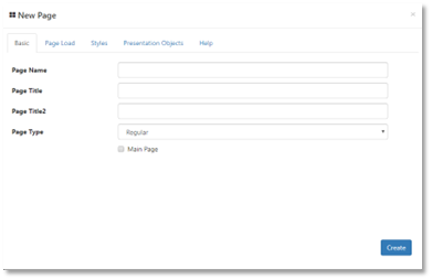
Figure 58 : Basic Page details
Select database option and enter backend logic(optional).
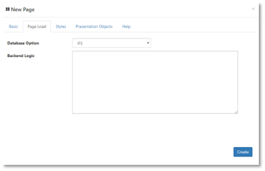
Figure 59 : Database option and Backend logic
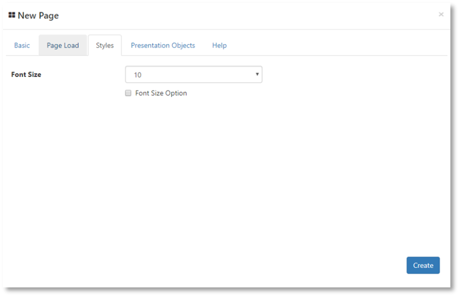
Select the Font Size(optional).
Figure 60 : Font styles
Presentation Objects to allow access to applications(optional).
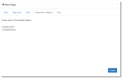
Figure 61 : Presentation Objects
Also, user can Export more than one page at once by selecting the (active) pages and click on the Export button.
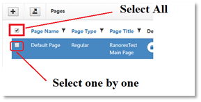
Figure 62 : Export Pages
Step 08: Design a page
User can design page/s by clicking on the ‘Design Page’ button in the page list.
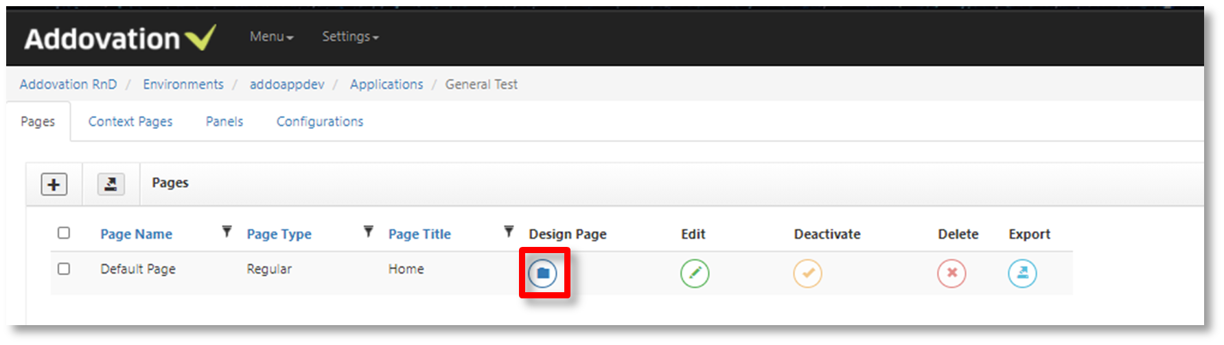
Figure 63 : Page details
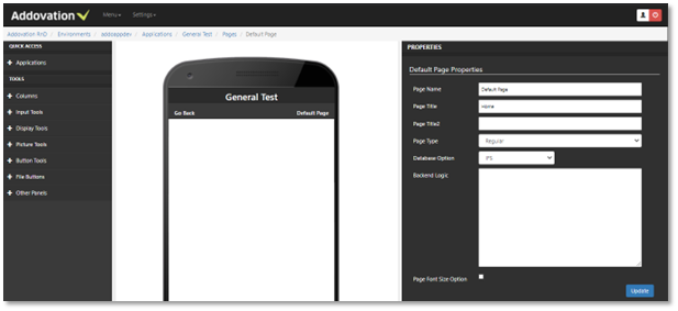
Figure 64 : Design page
Tutorial: Create a report in of work orders app
One common scenario is that we want to extract data from IFS Cloud, manipulate and then push back.
Step 1: Identify flow and objects in IFS Cloud
Let's create an app that fetches all active work orders, allowing the logged-in user to view their current tasks and update the status with a simple button. Consider this work order in IFS Cloud:
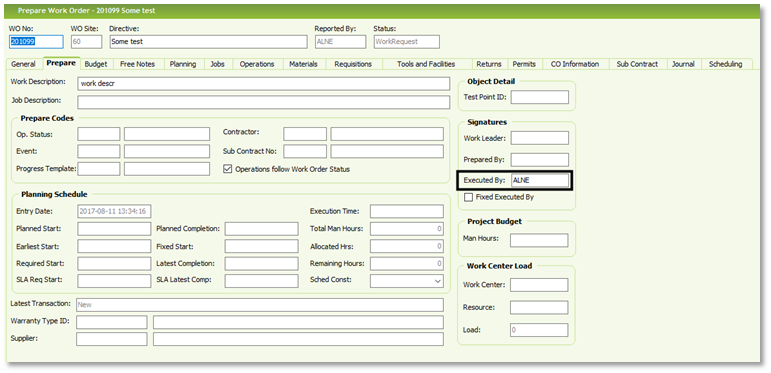
Figure 65 : Work Order Sample
The work order has executed by set to user ALNE. Next step is to identify what view this in IFS to write our query, this is being done by enabling the system info task pane (note that common practice in IFS Cloud is to not have this task pane available for all end-users, if you don’t see it please consult your local IFS Cloud system administrator):
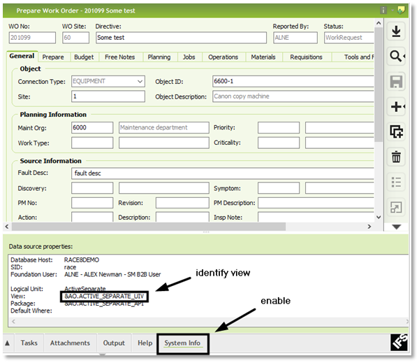
Figure 66 : System info
In this case, it turns out that the view is being called &AO.ACTIVE_SEPARATE_UIV, and we can write a simple ‘select *from &AO.ACTIVE_SEPARATE_UIV’ in our favorite SQL query tool (e.g. PL/SQL Developer).
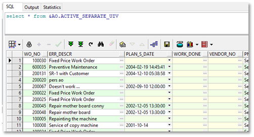
Figure 67 : SQL
The query used in IFS Cloud can easily be found by turning on the debug console:
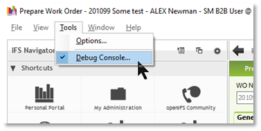
Figure 68 : Prepare Work Order
For instance:
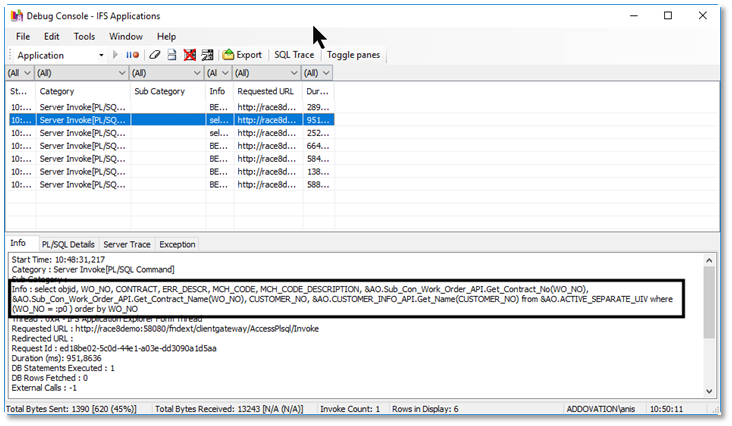
Figure 69 : Debug console
Modify the query as needed. Below is an example of the query:
SQL Query Example:
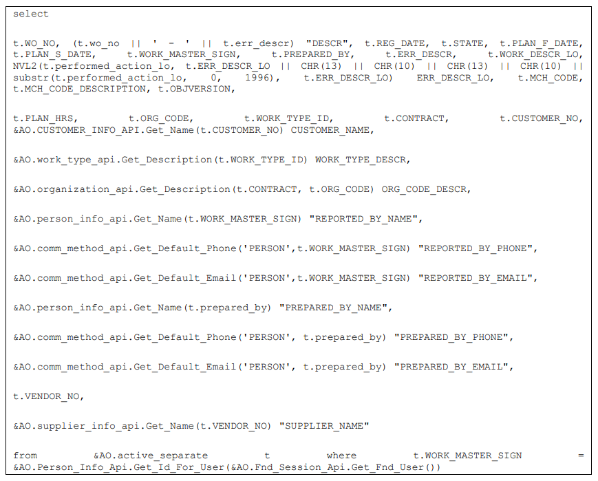
Make sure the result is as expected (either in PLSQL or as a quick report):

Figure 70 : Result
In our case, 3 rows are being returned so that’s fine.
Step 2: Create new app
Continue by adding a new app: Ex: Add application name as “My Active Separate”, create a page and design the page.
Before we proceed, we should have some idea on how we want the layout to look like, so we recommend drawing a wire frame on paper or using some 3rd party tool. We will proceed by showing how you can achieve this layout:
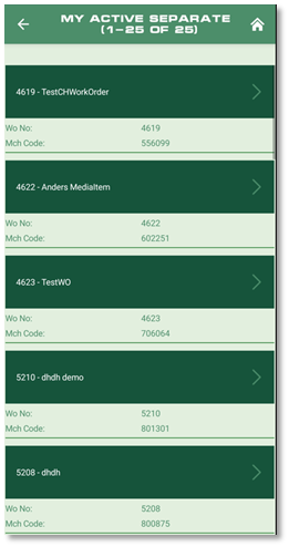
Figure 71 : Addovation Go
Go back to the editor and scroll down in the menu until you find the “List Button”, by using drag and drop you can easily map it onto your application, and by clicking on the item in the app we can modify its properties:
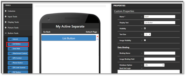
Figure 72 : Design page
Change the custom properties as below:
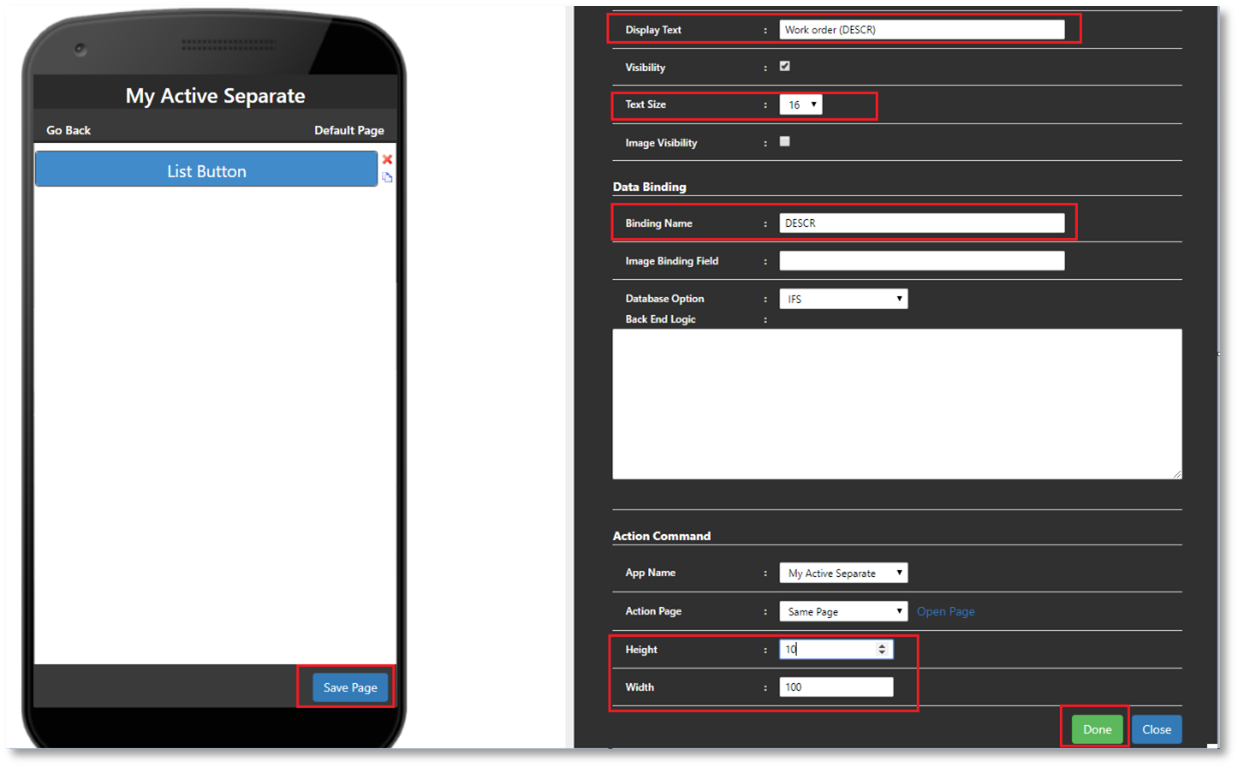
Figure 73 : Custom properties
Now finalize result by pressing “Done” and then “Save Page”.
Next drag and drop the “Double columns” (since we want to have two columns in the result):
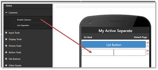
Figure 74 : Double columns
Lastly, we will drag and drop the labels into each column, starting with the pure text label.
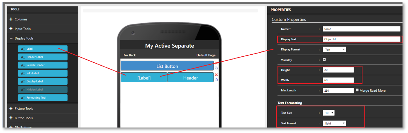
Figure 75 : Label properties
Remember to press “Done” after changing properties (otherwise changes will be lost).
Now drag a label again into the second column and click on it to get the properties, change height and text size:
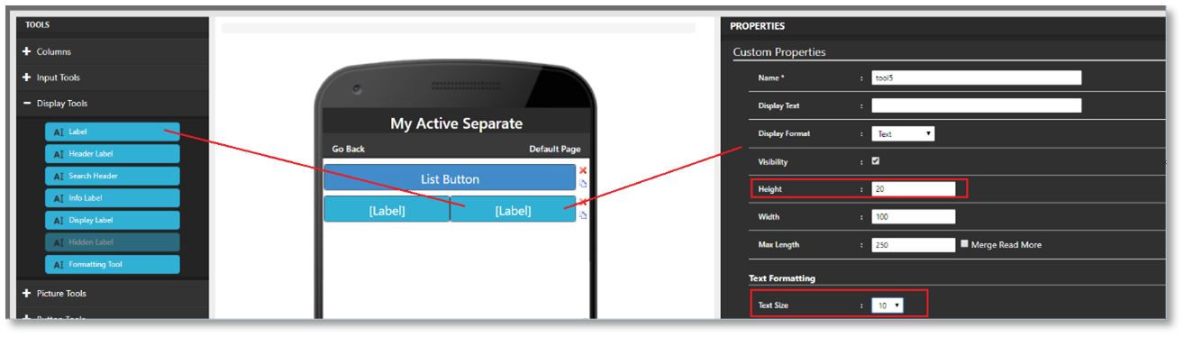
Figure 76 : Custom properties
If you want to sort or re-arrange tools into another place, then click Rearrange Controls.
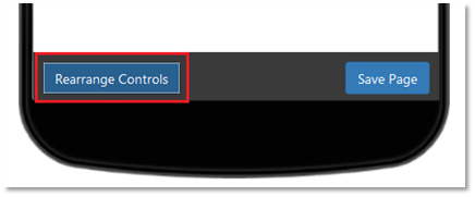
Figure 77 : Rearrange mode
You won’t be able to change properties in ‘Rearrange Controls’ mode. Hence you need to click ‘Edit Mode’ to go back to change properties.
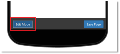
Figure 78 : Edit mode
Add the binding towards our SQL query by simply entering the field name:
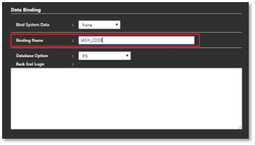
Figure 79 : Binding name (i)
Next, repeat the process by adding another 'Double column.' Add two additional labels, with the first labeled 'Work descr.:' and bind the second label to the SQL field ERR_DESCR:
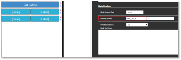
Figure 80 : Binding name (ii)
Finish off our layout by pressing “Done” and then “Save Page” as stated above.
Test App
Now it is time to verify the results in the app. Open Addovation Go and select cloud URL, enter system id and enter the credentials required:
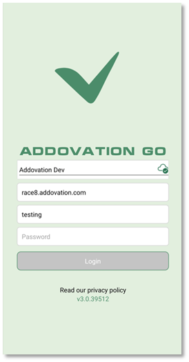
Figure 81 : Addovation go login
After a successful login, assuming your end-user has the necessary credentials you will find the application in the main menu list:
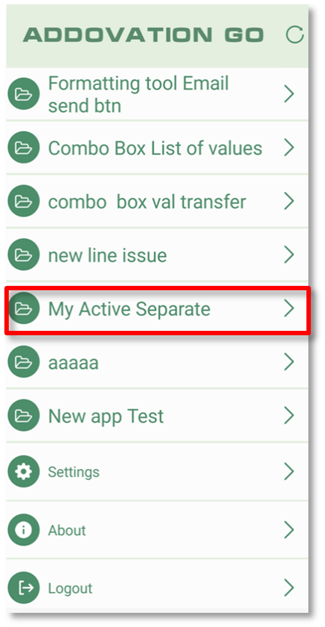
Figure 82 : Menu
By tapping on the item, it should execute the SQL towards IFS and display the result according to the design we just created:
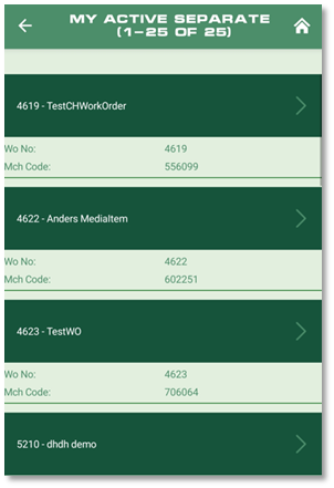
Figure 83 : Result
Verify that same result is being displayed in the app as in the SQL result.
Step 4: Create detail view and action button
Create a new page for our application in the Designer interface and Supply the following information:
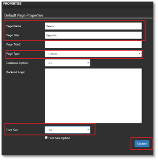
Figure 84 : Supply information
Save the page by clicking 'Update.' Then switch to design mode, add two columns and two labels to display the current work order, such as 'Wo No:'.
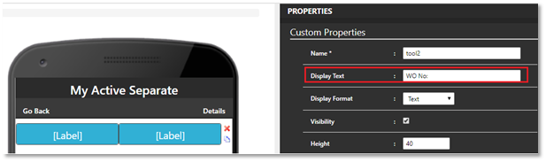
Figure 85 : Check Work Order
Bind the second label as below.
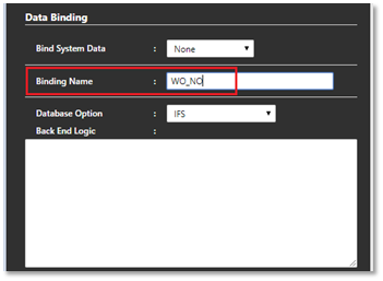
Figure 86 : Data Binding
Click 'Done' and 'Save Page,' then add the state. Repeat the process and confirm that the configuration has been saved successfully.
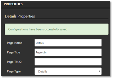
Figure 87 : Save Configurations
We are now ready for the final step in our mobile application: creating the button, binding it to the work order, and executing a simple custom PLSQL statement. In its most basic form, it might look like this:

Drag and drop the button into the details view. Configure it as needed, add the logic, and set the desired text on the button.
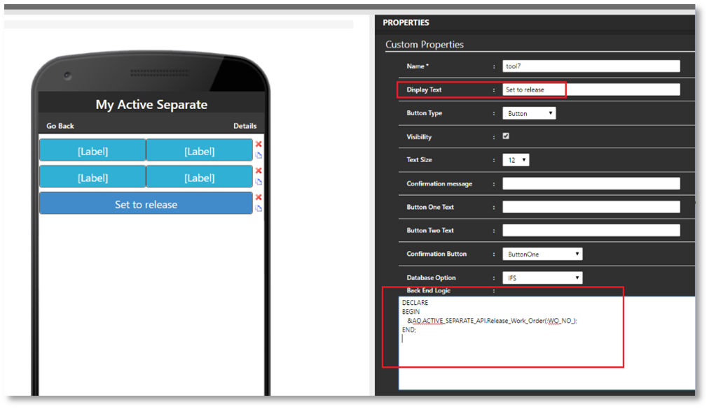
Figure 88 : Back End Logic
The last step is to specify that when the list button is tapped, we want to navigate to the details view. Go to the 'My Active Separate' pages and click the 'Design' button.
Tap on the “List Button” in the editor and change the Action Page to “Details” as we just created.
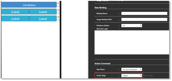
Figure 89 : Action Page details
Finish off by pressing “Done” and “Save page” and we are finally ready to test our app.
Step 5: Test the app
Press the refresh icon on the app to re-load all configurations.
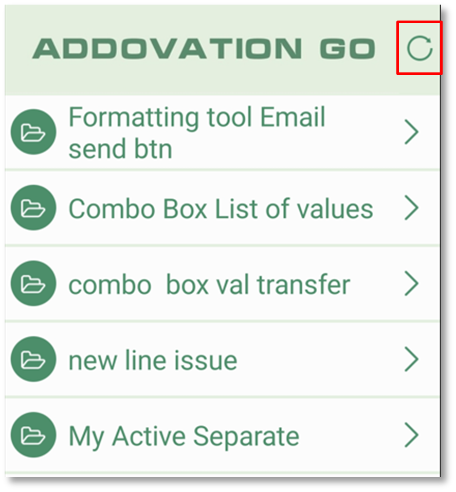
Figure 90 : Refresh
Then tap on Application Name.
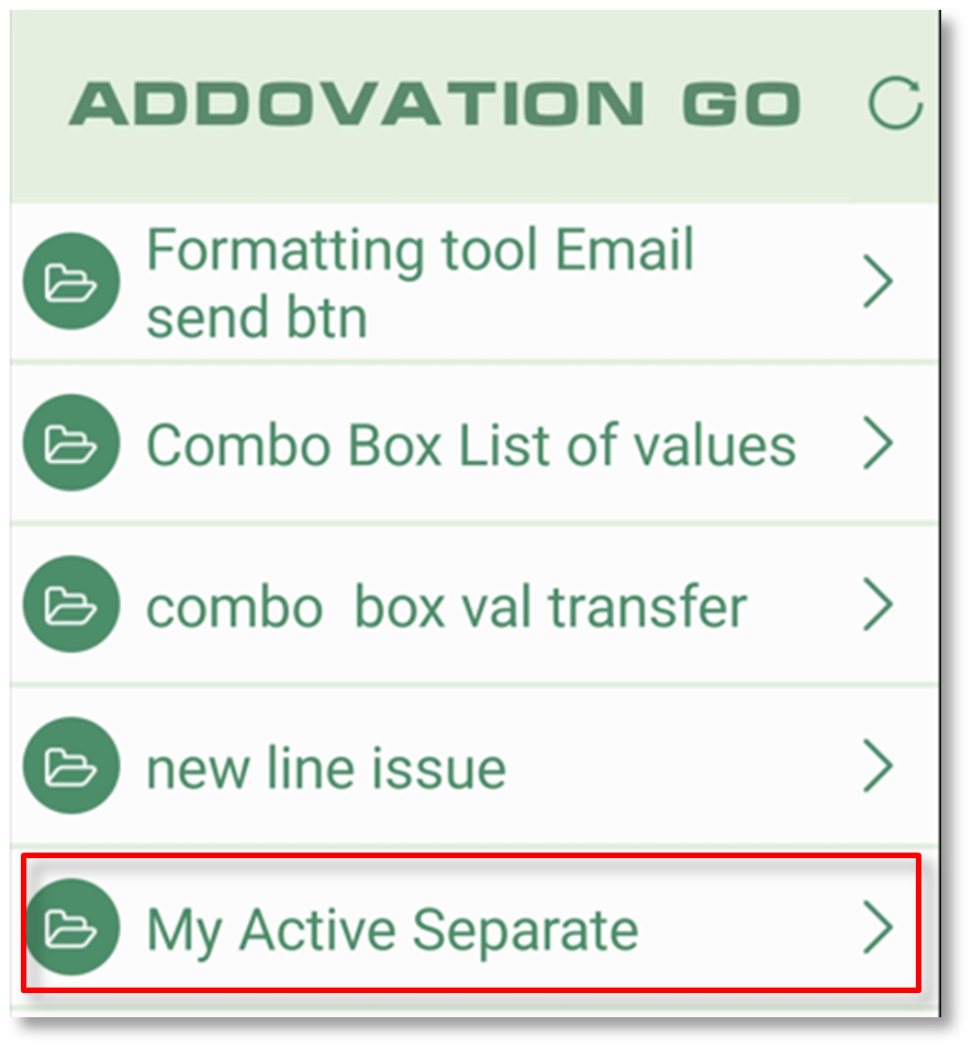
Figure 91 : Menu
Then tap on an item in the list.
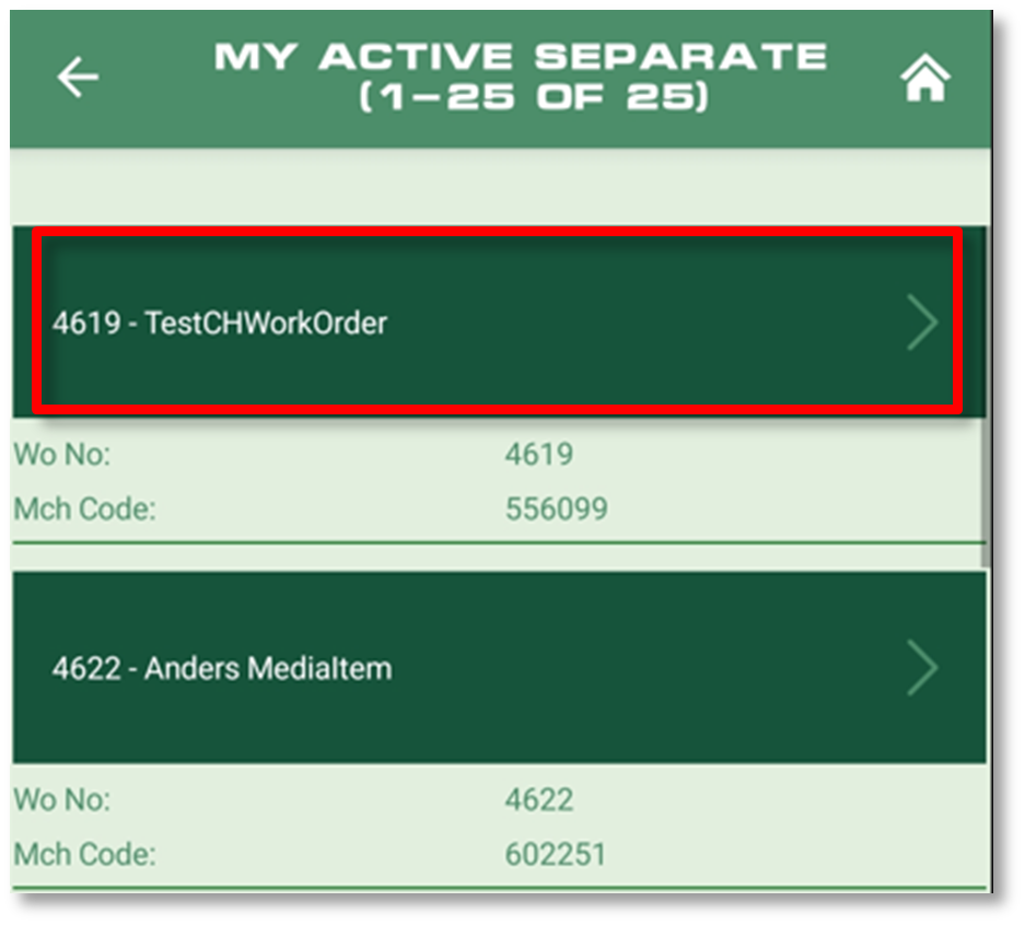
Figure 92 : Tap on list item
Verify the status in detail view:
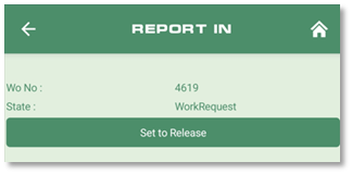
Figure 93 : State
Press the button “set to release” to execute our PLSQL block and verify that a message appears.
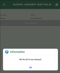
Figure 94 : Set to release message
Finally, verify that the work order has reflecting changes in IFS Cloud:
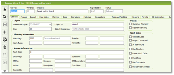
Figure 95 : IFS – Prepare work order
Congratulations, you have created your first mobile application!
Page Design Tools
There are two types of columns which can be used in application pages.
- Line Separator
- Double Columns
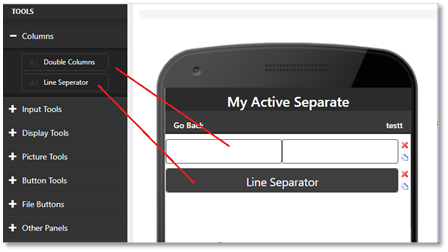
Figure 96 : Columns
Also, there are several types of input tools, display tools, button tools, picture tools, file buttons & panels. Users can just drag each to the application. After adding a tool Users can change the properties of each tool.
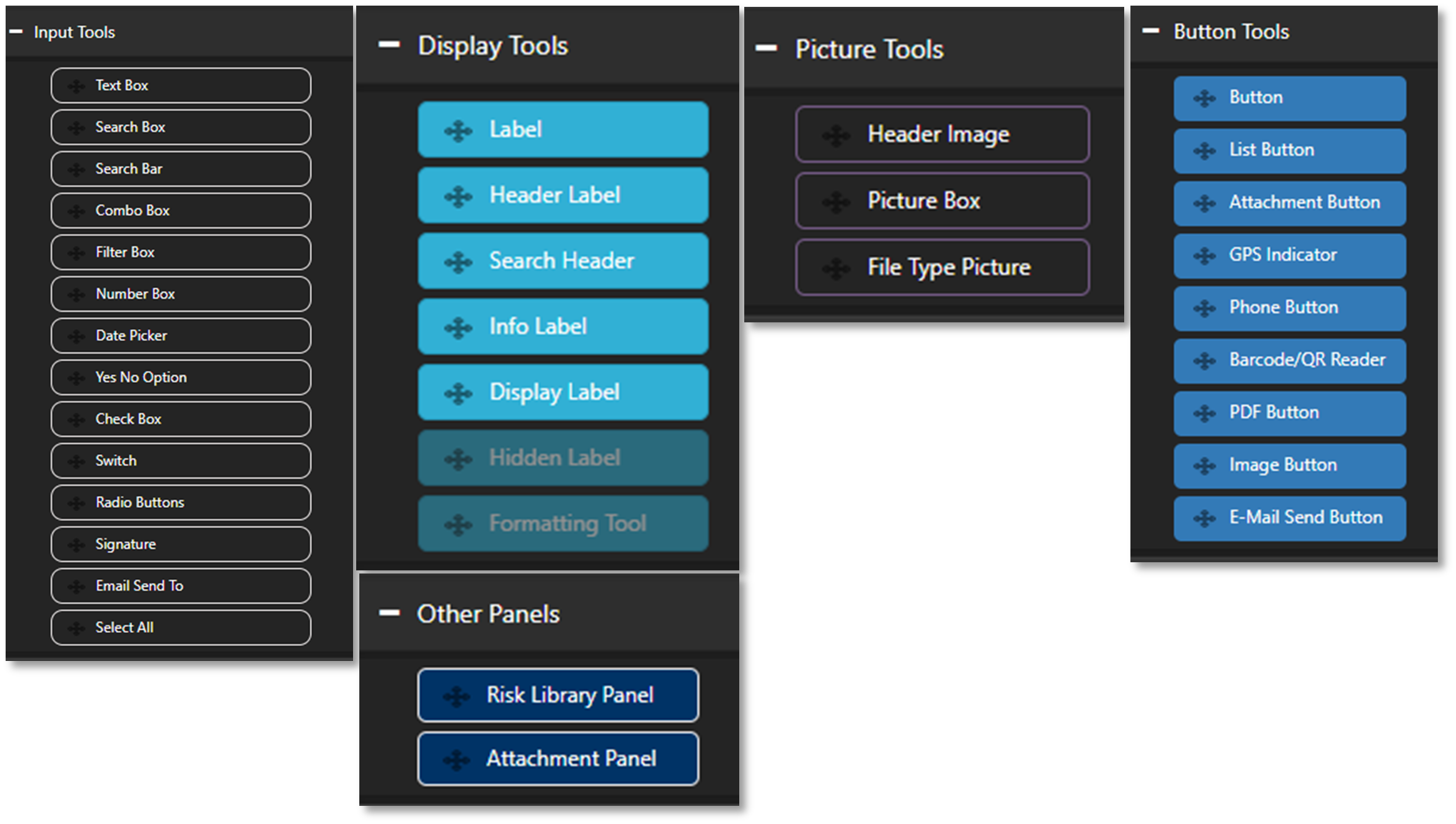
Figure 97 : Tools
Input Tools
Text Box
User can type and edit same as normal textbox.

Figure 98 : Text Box
Search Box
Using PL/SQL to populate search boxes and controls
After dragging a search box into the application, users can change its properties by clicking on that search box. For search boxes users can enter the Binding Name, In or Out & can specify the backend logic for search criteria. Then it will populate the data according to the logic.

Figure 99 : Search Box
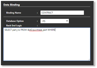
Figure 100 : Enter Search Box details
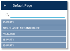
Figure 101 : Populated Data
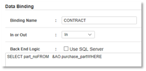
Figure 102 : Enter the details for Search Box
Search result count
Go to the Designer & add both search header & search box tools to the page.
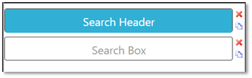
Figure 103 : Search result
In the search box properties under "Result Count," enter the "Search Header Name" in the result count field.

Figure 104 : Result count
Now you can see the result count for the search in mobile client.
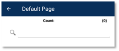
Figure 105 : Count
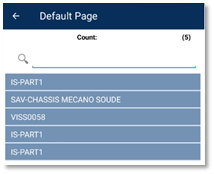
Figure 106 : Show the result count
Search Bar
After dragging a search bar into the application users can change its properties by clicking on that. You need to add a separate text box to display search bar results.

Figure 107 : Search bar
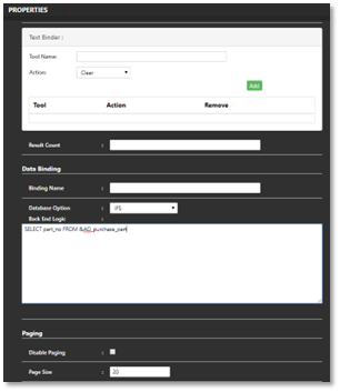
Figure 108 : Properties
Search Bar appears in mobile client like this.
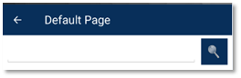
Figure 109 : Addovation Go
Combo Box

Figure 110 : Combo box
Relationship between Combo Box setup
This will be discussed under the heading "Combo Box Properties", section "Parent Tool: Relationship between Combo Box setup".
Combo Box Properties
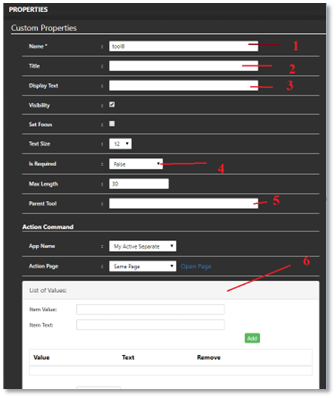
Figure 111 : Combo box properties
Name: By default, there is a name to the combo box. Users can change that.
Title: Title will displayed on the top of the combo box.

- Display Text: This will populate the data to the combo box.


Is Required: If this set to true, it will be mandatory to select a value to the combo box.
Parent Tool: Relationship between Combo Box setup
Users should untick the ‘Is Auto Load’ option on bottom of the properties to use this tool.

You need to enter the 1st combo box name in parent tool.

If you don’t use parent tool you can keep it as empty. Put the tick on ‘Is Auto Load’ option.

When using two combo boxes, the values in the second combo box will load only after selecting a value in the first combo box. This behavior is managed by the parent tool. With this tool, users can create a hierarchy by combining multiple combo boxes. If the value in the first combo box is changed, the values in the dependent child combo boxes will also update accordingly.
- List of Values:
Users can hard code the data to the combo box from list of values. Users can predefine the values to the combo box.
Combo Box Data Binding
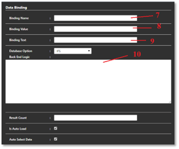
Figure 112 : Combo box data binding
- Binding Name: Name of the database column that should serve as the binding field.
- Binding Value: This value connects with ifs data and populate values into combo box.
- Binding Text: This is the display format of values of the combo box data.
- Back End Logic: Retrieve data for controller/element. Here users can apply conditions.
Select a value to a combo box from Addovation Go mobile client.
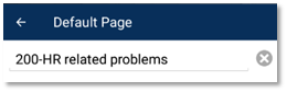
Figure 113 : Addovation Go
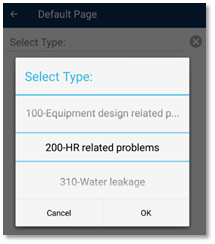
Figure 114 : Select type
Filter Box

Figure 115 : Filter box
The Filter Box shares the same properties as the Combo Box, with the key difference being that the Filter Box allows users to filter search results by typing.
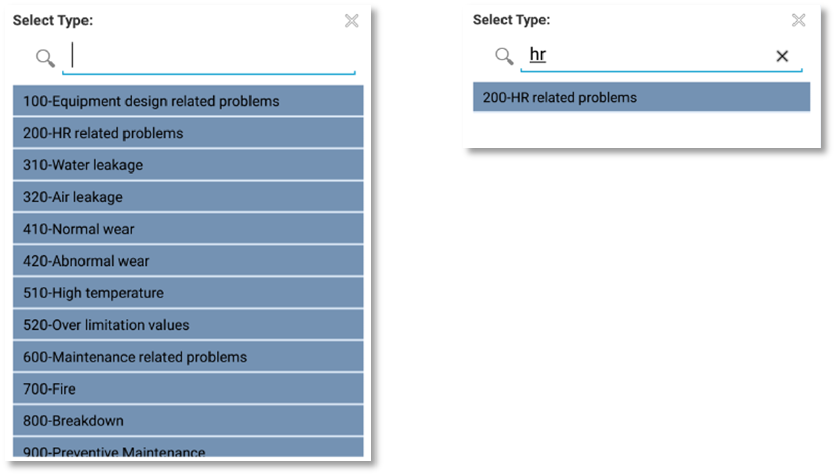
Figure 116 : Addovation Go
Number Box
This is only permitted for inputting numbers and functions as a text box.

Figure 117 : Number box
Date Picker
Date Picker use to display the date. You can give a specific date or current date as an initial display date.

Figure 118 : Date picker
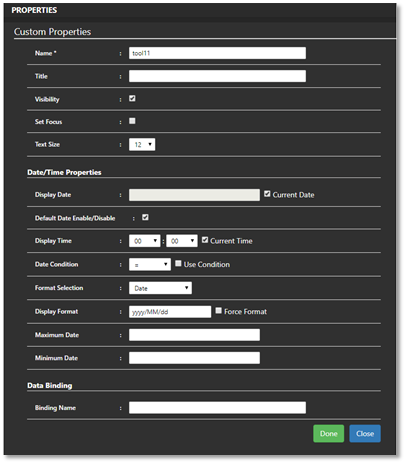
Figure 119 : Date picker properties
The Date Picker appears in the mobile client as shown below. You can customize the display format and apply various conditions to this tool through its properties.
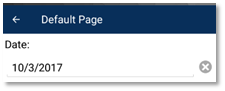
Figure 120 : Addovation Go
"Yes, NO" Option
The Yes/No button in the mobile client supports an action page and also evaluates several conditions.

Figure 121 : Yes/No option
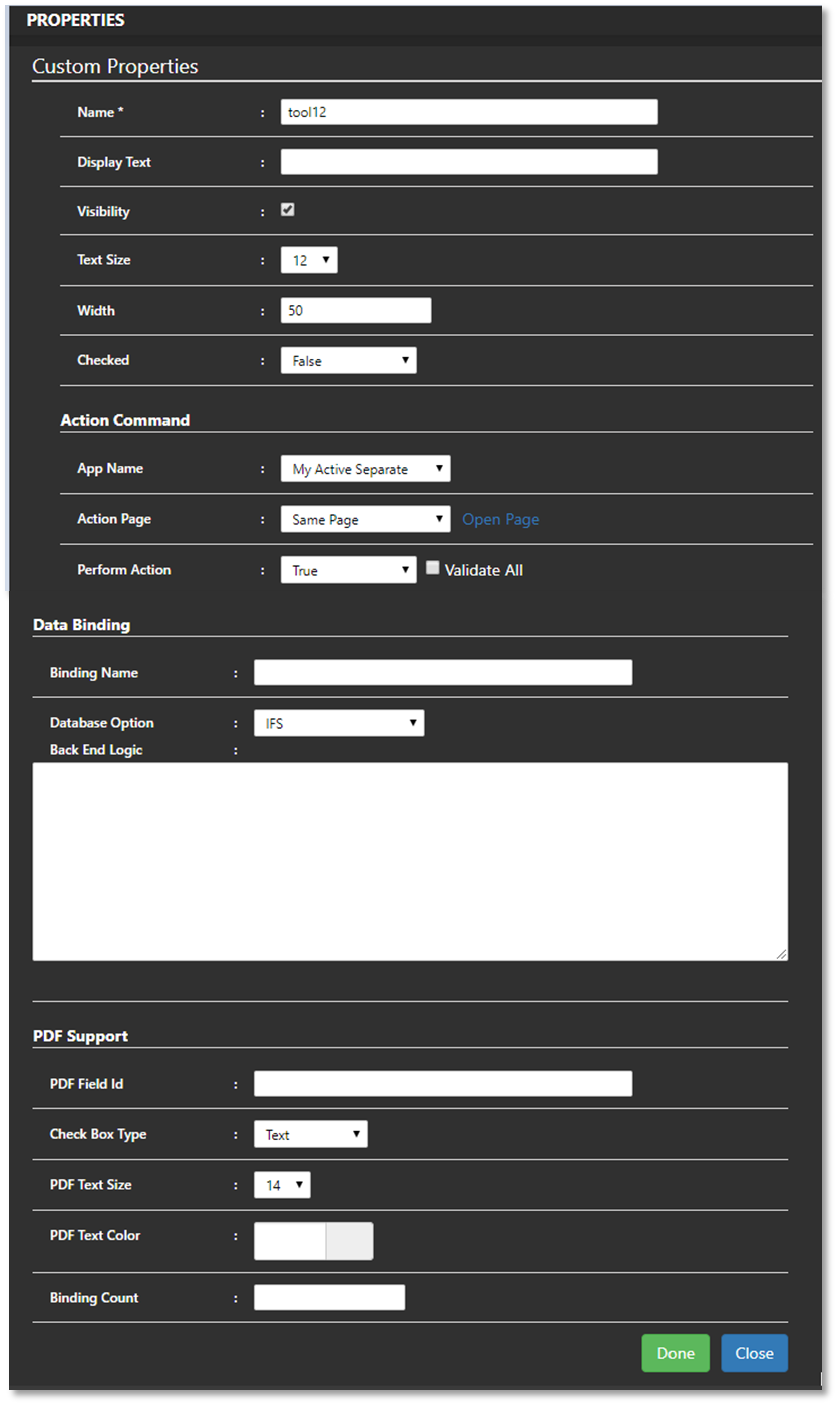
Figure 122 : Yes/No option properties
When you switch on this button it will redirect to another page.
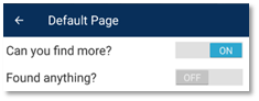
Figure 123 : Addovation Go
Switch
Switch tool is an extended version of Yes, No tool where it supports to contains 3 options and all options are configurable.

Figure 124 : Switch
Radio Buttons
Radio Buttons allows you to input a value from multiple values.

Figure 125 : Radio buttons
Signature
The signature tool allows you to provide your signature.

Figure 126 : Signature
Email Send To
This is use to get email addresses from the phone book.

Figure 127 : Email send to
Select All

Figure 128 : Select all
The 'Select All' option allows users to choose multiple values from a list panel in the mobile client. When this tool is used on a page, an additional row will appear below the page header as shown.
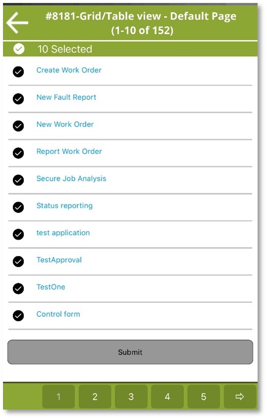
Figure 129 : Select all list
Display Tools
Label
The label allows you to either display data or set a bind name, such as WO_NO.

Figure 130 : Label
Header Label
You can add this for headings.

Figure 131 : Header
Search Header
Search header can be used to display the search count.

Figure 132 : Search header
Info Label
The Info Label adjusts its font color, font size, font style, visibility, value clearing, background color, and enable state based on the formatting status.

Figure 133 : Info label
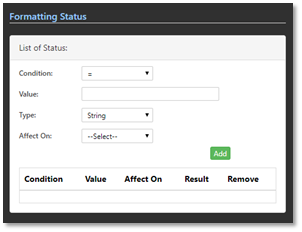
Figure 134 : Formatting status
Display Label
Two values are passed to this tool: the Display Name is used to show the title, and the Value is used to display the actual value.
E.g.: Name= abc, value = ‘abc’.

Figure 135 : Display label
Hidden Label
Hidden label could contain values but not visible for users. Ex. ID's and keys use to perform actions, but not required to display values to the user.

Figure 136 : Hidden label
Formatting Tool
Using the formatting tool, the user can enter other tools (e.g., textbox with Tool Name: tool2) and select options like Font Color, Font Size, Font Style, Visibility, Clear Value, Background Color, and Enable under "Affect On." By using the "Add Tool" button, the selected tool is added to the list.

Figure 137 : Formatting tool
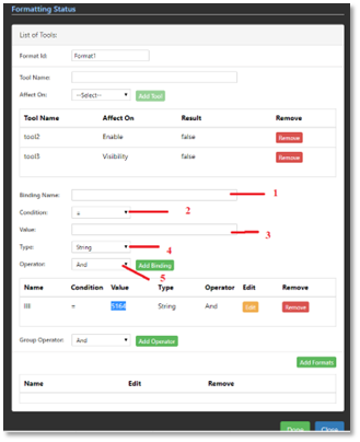
Figure 138 : Formatting status
- Binding Name: Name of the binding field
- Condition: There are several conditions available [ =, <, >, <>]
- Value: Enter the value
- Type: There are several types available, [String, number, decimal, date, date time, time, Boolean]
- Operator: And, OR operators are available
User can add formats for the other tools ,base on the conditions here.
Button Tools
Submit
Passing variables between pages
It should be a detail page to accept the values from another page.
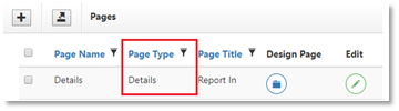
Figure 139 : Set the action page type as details
How to set the Action Page of a Button
For example, in the 'Separate AO Details' button properties, set the action page to 'Separate AO Details'. When the button is clicked, it will redirect to the 'Separate AO Details' page because the action page is set to that.

Figure 140 : Set the action page
Bind the data between two pages
- The main page will return the "wo_no_desc" variable.
- The action page for the 'Separate AO Details' button is set to the 'Separate AO Details' page.
- In the 'Separate AO Details' page, under data binding, set the Binding Name to wo_no_desc (which is passed from the main page).
- This allows the variable values to pass from one page to another.
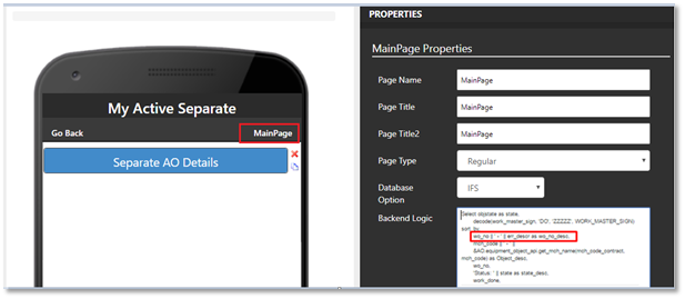
Figure 141 : Main page
Text Binder
We can set a Text Binder for each button. When the button is clicked, the Text Binder will perform actions like clearing or setting default values for the selected tool(s).
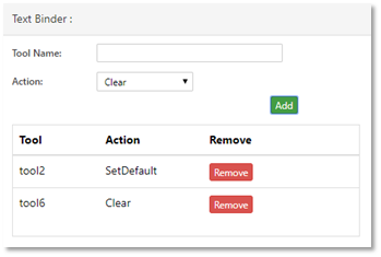
Figure 142 : Text binder
Dynamic Dialog
Dynamic Dialog boxes should create from list of messages in Addovation Go Designer. User can view it in Button properties List of Operations -- > List of Messages
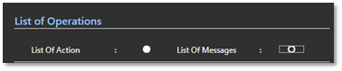
Figure 143 : List of messages (i)
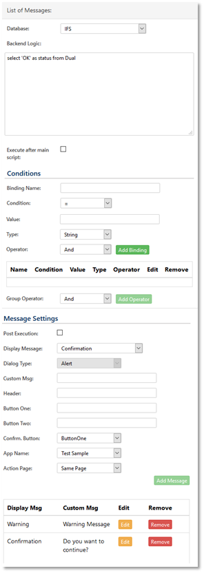
Figure 144 : List of messages (ii)
Here we can see three sections as below.
Database Command
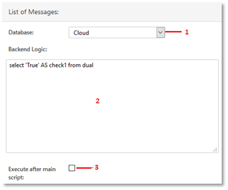
Figure 145 : Database command
1 - Select Database type (Cloud/IFS)
2 - Enter Backend Logic
3 - If you want to execute this command after Main Backend Logic, then tick this option.
Conditions
Users can enter conditions based on backend logic or any other conditions. A group facility is also available for this purpose.
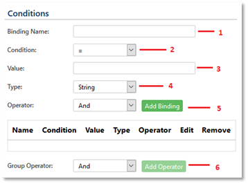
Figure 146 : Conditions
- Binding Name: Name of the binding field
- Condition: There are several conditions available [ =, <, >, <>]
- Value: Enter the value
- Type: There are several types available, [String, number, decimal, date, date time, time, boolean]
- Operator: And, OR operators are available
- Operator: And, OR operators are available. User can group Conditions from this.
Message Settings
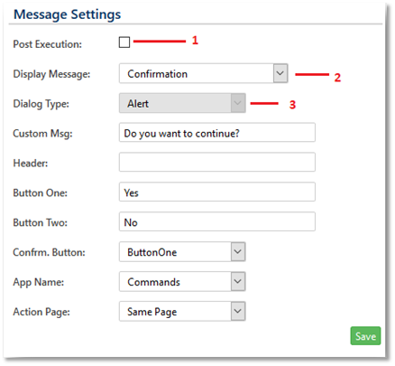
Figure 147 : Message settings
- Post Execution:
If you want to display message after executing main backend logic then tick post execution to display message after running the main script.
Display Messages: There are four display messages (Error, Confirmation, Warning and Information)
Dialog Types: User Can Select four types of dialog types ( Alert, Flash, Notifications and Flash With Notifications)
List Button
This contains all the details for records and by clicking on that you can pass those details to another page.

Figure 148 : List button
Attachment Button
How to Send a File Attachment (Image or Document)
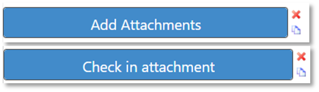
Figure 149 : Attachment checking in
- Drag and drop the ‘Attachment Button’.
- Set the attachment properties.
- Add a ‘Submit’ button and rename it (e.g., "Check In").
Attachment properties
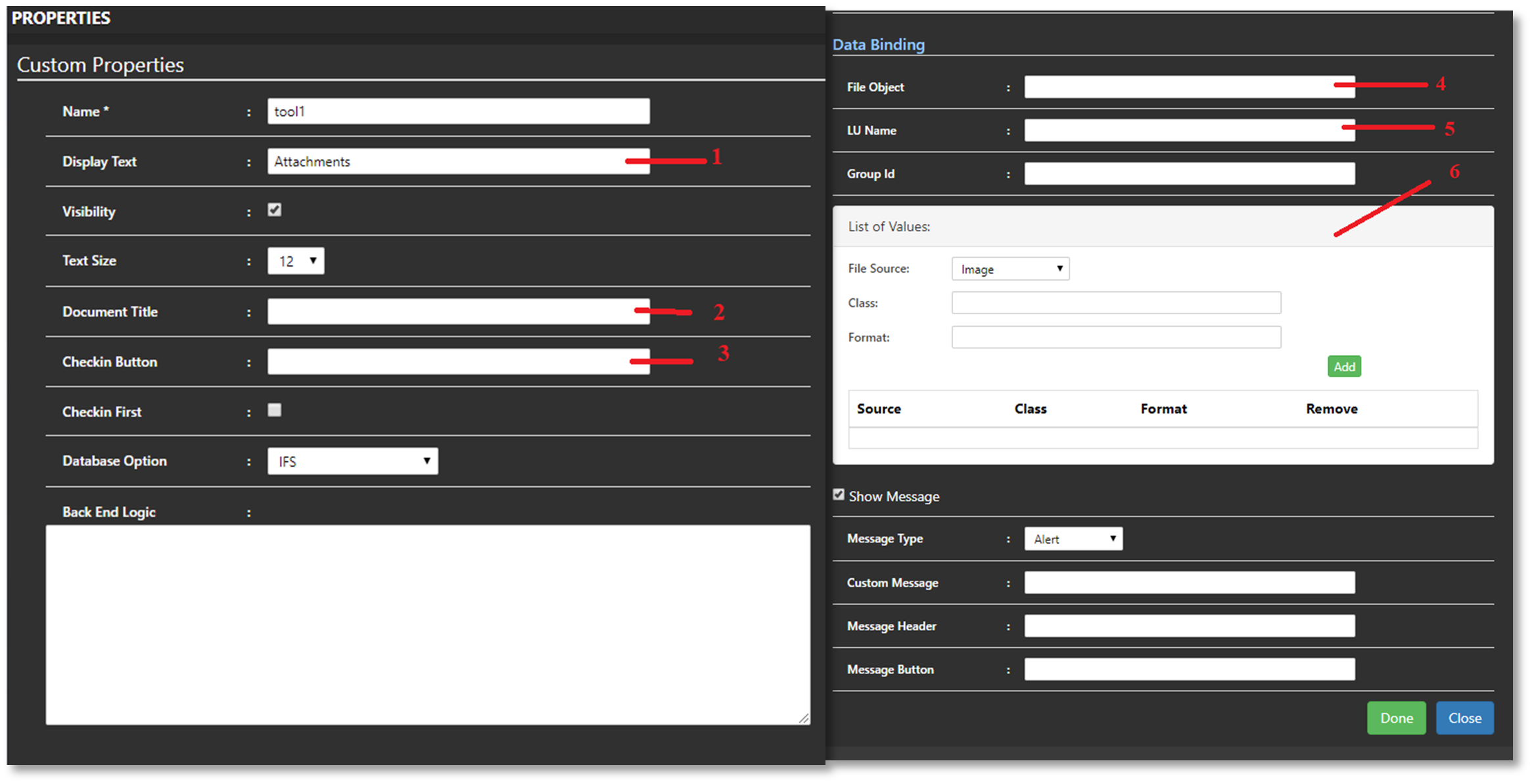
Figure 150 : Custom properties
Display Text: Users can add any text value here. It will display on top of the attachment button.
Document Title: Users can enter any title for ‘Document Title’. Documents will be checked in to the IFS under this title.
Check in Button: Enter the tool name of the ‘Check in Attachments’ button. Documents will be checked in after click on ‘Check in Attachments’ button.
File Object: This allows connecting towards multiple object connections in IFS.
LU Name: From Logical Unit, users can connect the attach objects (Documents/Photos) with the IFS LU.
List of Values: Under the list of values, you need to set the class and format separately for documents and images. This is essential.
Steps to Attach an Image/Document from the Mobile Client
Step 01: Click on ‘Attachments’ button
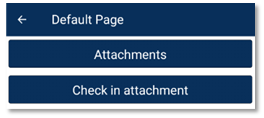
Figure 151 : Addovation Go
Step 02: Select the file type (e.g.: image or document)
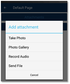
Figure 152 : Select Attachment type
Step 03: Browse the file & click on ‘Check in Attachment’ button.
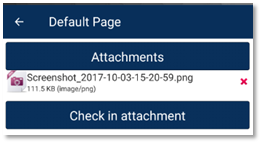
Figure 153 : Attachment is attached
GPS Control
This will track the GPS location and display GPS coordinates.

Figure 154 : GPS control
Phone Button
When click on phone button, it will generate a phone call to the given phone number in its properties.

Figure 155 : Phone button
Barcode / QR Reader
QR code scanner scans values using the camera and extract info and make it available as string. That string will bind with the binding value given.
QR code scan results will be available for display on other labels on the same page.

Figure 156 : Barcode / QR reader
PDF Button
In risk libraries, there are evaluations, and each evaluation element is mapped to a specific field. When the Generate PDF button is clicked, the evaluations gather user inputs and merge them with an existing PDF uploaded through the Designer. The updated PDF is then checked into IFS and displayed to the user. (This is used under SJA.)

Figure 157 : Generate PDF
The Generate PDF properties in Designer allow you to configure whether the PDF is displayed after creation or not.
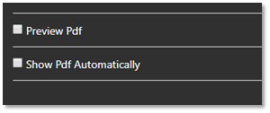
Figure 158 : PDF display alternatives
Image Button
Image button supports user to have an image on the button. It acts as a regular button afterwards.
E-mail Send Button

Figure 159 : Send mail
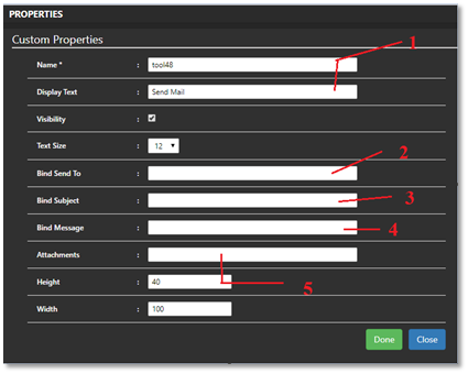
Figure 160 : Send mail properties
- Display Text: This will display on top of the button.
- Bind Send To: Enter the textbox tool name which included recipients the mail address.
- Bind Subject: Enter the textbox tool name which included Mail subject.
- Bind Message: Enter the textbox tool name which included Mail Body (message).
- Attachments: Here you can use ‘Attachment control’ Name.
Steps to Send an Email from the Mobile Client
Step 01: Click on ‘Send Mail’ button. Step 02: Select any mail app & send the mail. Step 03: Send the mail.
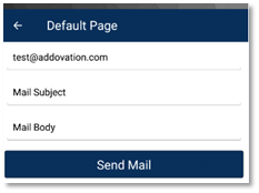
Figure 161 : Step 01
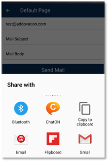
Figure 162 : Step 02
Other Panels
Risk Library Panel
Risk elements & evaluations will autofill inside this risk library panel. This tool will be described more in 13th chapter.

Figure 163 : Risk library panel
Attachment Panel
Multiple attachments can be included inside using Attachment Panel.

Figure 164 : Attachment panel
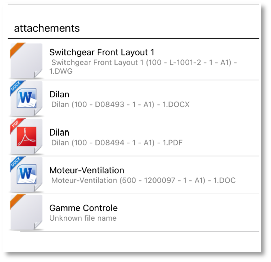
Figure 165 : Addovation Go
Expandable Panel
Expandable Panel is simply a control which user can expand and collapse. Expandable Panel is yet another page type and you can include any tool inside the panel.

Figure 166 : Expandable panel
Expandable Panels are visible in toolbox, only if you have created “Expandable Panel” page type pages.
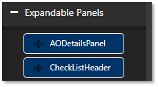
Figure 167 : Expandable panels
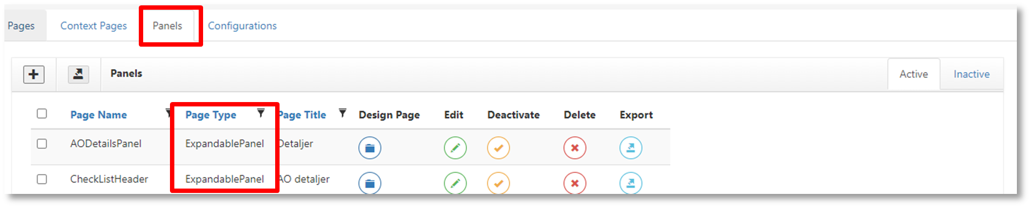
Figure 168 : Expandable panel details
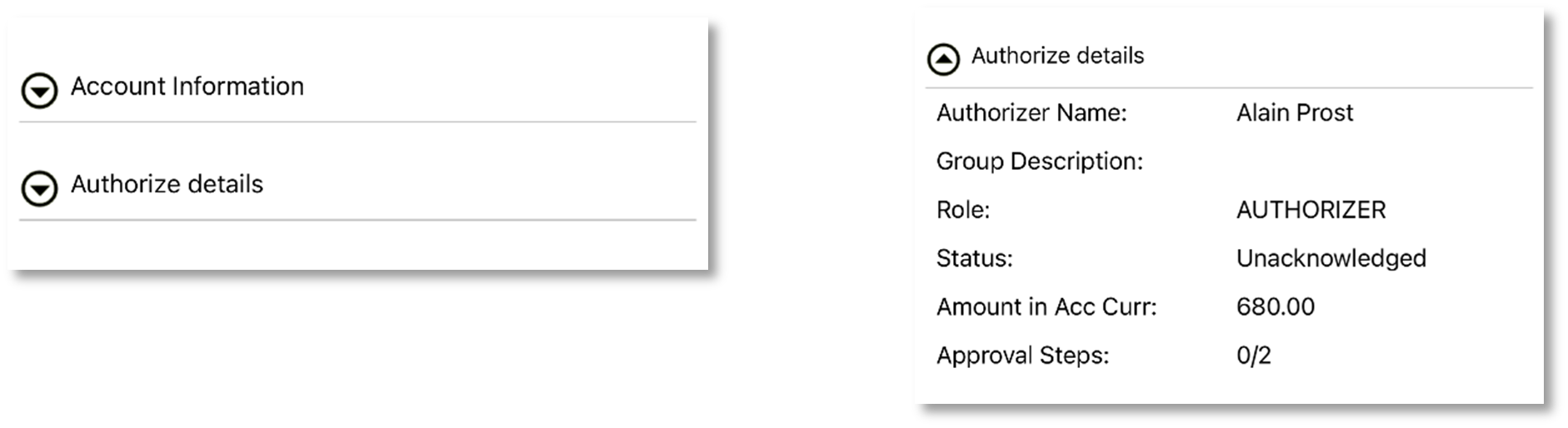
Figure 169 : Addovation Go
List Panel
The List Panel is a panel that contains a list of items. It is also a page type and will only appear in the toolbox after you create a 'List Panel' type page.

Figure 170 : List panel (i)
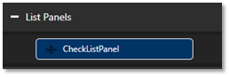
Figure 171 : List panels (ii)
Footer Panel
The Footer Panel is a panel that resides at the bottom of the mobile client. It is also a page type, and once the page is created, it will appear under 'Footer Panels' in the toolbox.

Figure 172 : Footer panel (i)
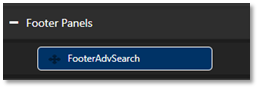
Figure 173 : Footer panel (ii)
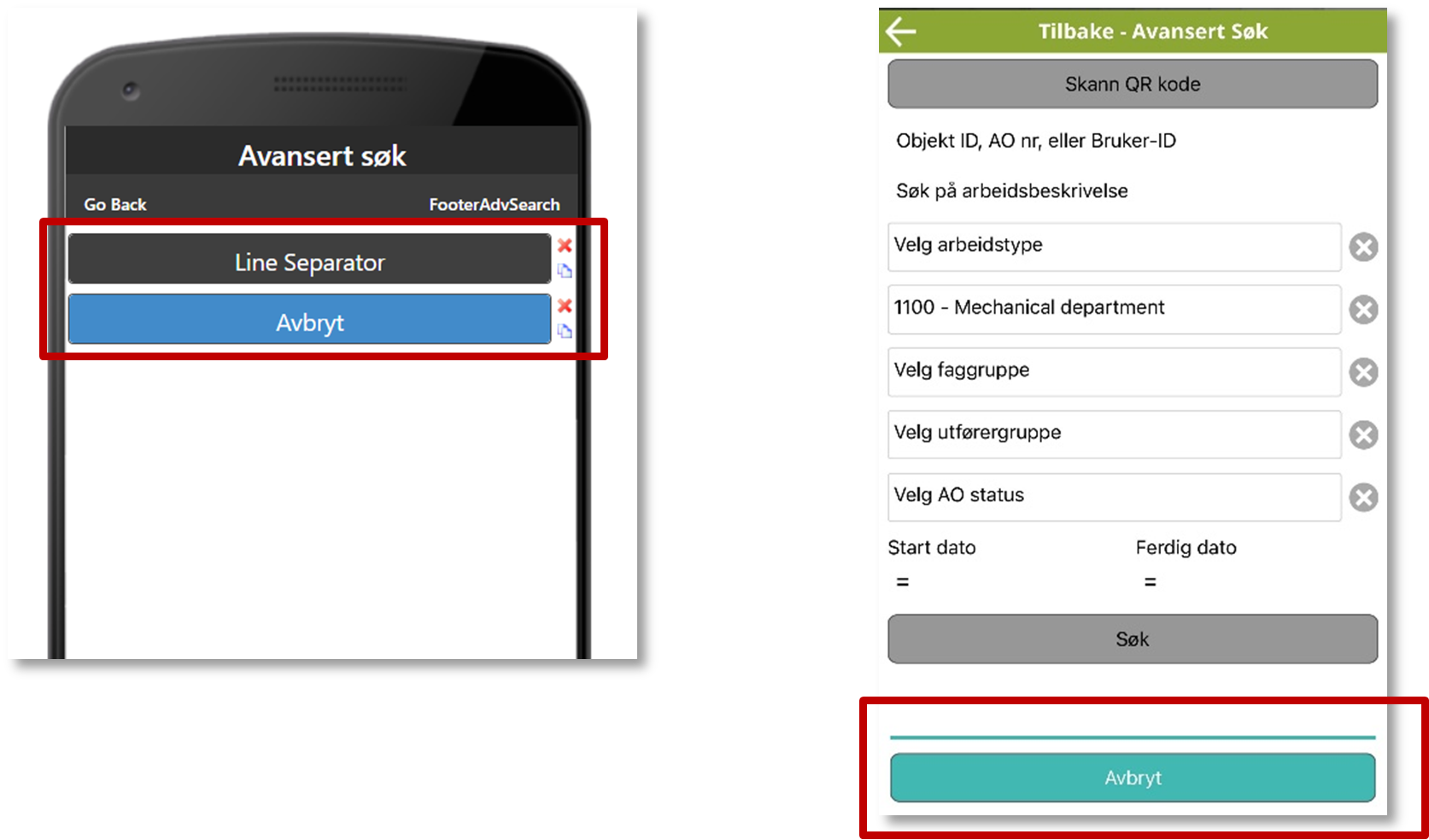
Figure 174 : Footer panel (iii)
Picture Tools
Header Image

Figure 175 : Header image
Picture Box
The picture box will display an image based on a remote resource (URL). The image will be clickable and lead the app user to an external website location (as defined by a consultant in the Designer configuration for the tool).

Figure 176 : Picture box
File Type Picture

Figure 177 : File type picture
App Linking
Addovation Go supports App Linking on both Android and iOS operating systems. By registering and associating a specific URL with the mobile application, links in browsers and other applications will open the app. The App Link URL requires the application name, page name, and any other parameters you need to pass. All values in the URL should be properly encoded.
Format https:// applink.addovation.com/app={appname}&page={pagename}&{key1}={value1}&{key2}={value2}
Example https://applink.addovation.com/app=WorkOrderApp&page=SearchWorkOrdersPage&Company=100&Site=20
Limitations of App linking:
- The root of the link (URL) must always start with https://applink.addovation.com/
- In iOS, Email Sending is only allowed with the iOS default mail app
- On android you need to add the applink base url
13 Contact
Visit http://www.addovation.com for further information.